What does a brand audit include? Three layers with different inputs
A brand audit is a structured review of how a business presents itself, measured against how it says it wants to be seen. The definition is loose because the term covers three separate pieces of work. Pull them apart before anyone writes a quote, because each runs on a different kind of evidence.
The materials layer looks at the assets themselves: the logo and its variants, color, type, imagery, written voice, consistency across touchpoints, and the places where the guidelines run out. Everything it needs is already in your files. The perception layer asks how customers, prospects or staff see the brand, which means asking them. The positioning layer asks where the brand sits against competitors, which means studying other businesses.
That table is also the honest answer to how long does a brand audit take. The materials layer grows with the asset count. The research layers carry calendar time that no amount of skill removes: you can’t analyze interviews nobody has agreed to yet. So when one quote says a week and another says three months, the longer one almost always includes research. Ask whether your problem actually needs it.
The logo, judged where it actually appears
Logo review is the part most people picture, and the part most likely to slide into an argument about taste. A useful review asks practical questions of the files instead. Is there a full version, an icon and a dark-background version, and do they look like one family? Does the wordmark stay legible where it’s really used: a phone header, a social avatar, the corner of an invoice? Does a locked-up tagline survive being made small?
None of that needs a customer. It needs the exported files and someone willing to look at them at real sizes. We go further on the judging side in how to evaluate a logo design without arguing about taste, and on the size question in setting a logo minimum size that holds up.
Two things the files can’t tell you: whether the logo is memorable, and whether you’re legally clear to use it. Memorability is a perception question. Clearance is a legal search and opinion for a trademark professional, not a design reviewer.
Color, type and imagery: consistency without sameness
This is usually the longest section of a brand audit, and the easiest place to go wrong by treating every variation as a defect. A palette sheet doesn’t need the logo in the same corner as a promotional post. What should hold steady is the identity: core colors in their roles, each type family doing its job, a recognizable mood in the photography.
Prooflin’s sample Brand Audit for Aster & Co Interiors, a fictional Dubai interiors studio, makes the point in a section titled Consistency does not require sameness. It sets three supplied social tiles with different jobs side by side and concludes that differences in image area, headline scale and CTA presence “are not evidence of inconsistency by themselves.”
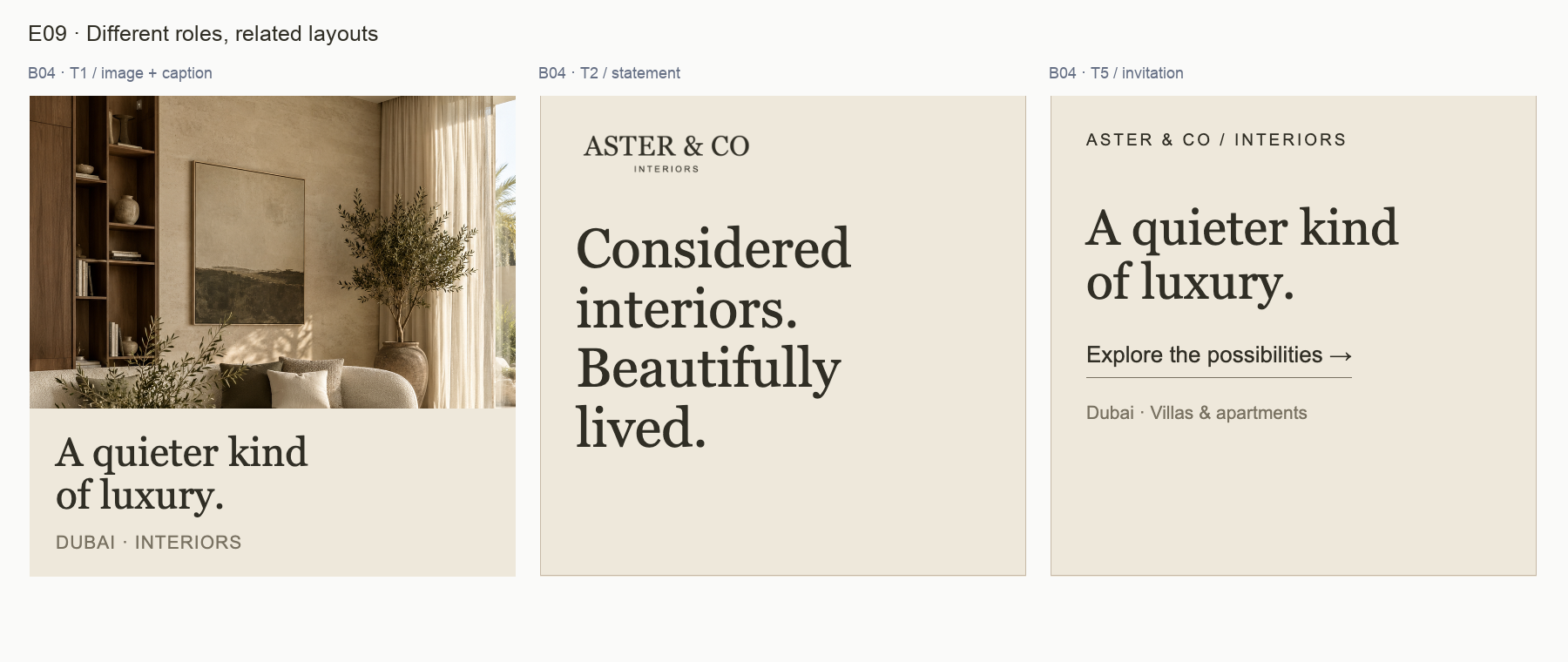
So the real question is narrower than “does it match?” It’s whether each piece keeps the identity intact and does its own job. If the answer to the first half is no across many pieces, you have the problem described in inconsistent branding that makes one business look like three. If it’s yes, but nobody could repeat the result without guessing, you have a rules problem. That one is far cheaper to fix.
Ad and social creative: where the brand meets a deadline
Ads and social posts get made under time pressure, often by whoever is free that afternoon, so drift shows up there first. A materials review of creative checks whether the largest text carries the message, whether the offer and next step read clearly at the size the piece will be seen, and whether each CTA phrase is used for one consistent purpose.
That last check is easy to skip. In the Aster sample, two compositions use different CTA phrases with the same calm visual treatment, and the report treats it as a missing rule rather than a mistake:
Tie each CTA phrase to a clear purpose
What the evidence shows
B03 ends its representative introduction with “Discuss your project”. T5 uses “Explore the possibilities”. Both are calm and compatible with the voice direction, but one suggests an enquiry and the other a broader exploration.
Recommended response
Assign an intent to each phrase before reuse. Keep “Discuss your project” for a genuine enquiry route. Keep exploratory language for inspiration or service discovery, making the destination clear in the surrounding copy where needed.
Notice what the finding doesn’t claim. The files are static, so it can’t say a button is broken or that one phrase converts better. Whether a rough ad will outsell a polished one is a question for the campaign numbers; read why ugly ads work, and when they just look cheap before brand polish overrules a creative that’s selling.
Guidelines: the rules nobody wrote down
Plenty of small businesses have no brand guidelines at all. Plenty more have a PDF from launch that nobody has opened since. The audit’s job is the same either way: find the decisions people are currently making by guessing.
Two of the Aster sample’s opportunities show what that looks like. F05, “Make supporting color choices repeatable”, notes that a pale note field on the brand board isn’t named in the four-swatch key; the report says its status needs a rule, not automatic removal. F09, “Formalize a small family of layouts”, observes that the social grid already uses several useful structures, but nothing says how a future author picks between them or keeps the hierarchy when a headline runs longer. Neither finding calls the current work bad. Both point at a decision the next designer would otherwise have to guess.
The parts that need customers, staff or competitors
Some questions can’t be answered by looking harder at the files. If the brief includes any of these, you’re buying research, and it should be scoped and priced as research:
- Do customers remember the name, and what do they connect it with?
- Do prospects assume you’re more expensive, or cheaper, than you are?
- Do staff describe the business the way the website does?
- Why did the leads you lost go with someone else?
- Which claims does every competitor in your category make, and which does nobody make?
- Is the name or mark clear to use in the markets you’re moving into?
The first four are perception questions. They need interviews, a survey, a careful read of your reviews or a frank hour with the sales team, and half a dozen honest conversations with recent customers often teach more than a long survey. The fifth is positioning, which needs a defined competitor set and someone prepared to read rivals’ websites critically. The last is legal.
The Aster sample is blunt about this. Under What remains unassessed it lists the channels it never saw (no live website, signage, packaging or actual social captions), then states that market positioning, memorability, trademark clearance, audience preference and conversion impact remain unassessed. A materials review that implies it measured how customers feel is overclaiming. One that names the gap lets you decide whether to fund research separately.
What a brand audit should hand back
Whichever layers you buy, judge the deliverable by whether someone could act on it next Monday. A mood board and a page of adjectives can’t be acted on. A useful report has these properties:
- Every finding points at a file. “Inconsistent color use” is an opinion. “The note field on the brand board isn’t in the palette key” is something a designer can open and check.
- Each finding carries a severity and a priority, so the owner can separate a P2 to settle before the current pieces get reused from a P3 that can wait for the next rules update.
- Confidence is stated. Something visible in the file earns high confidence; a contextual judgment earns less; audience reaction shouldn’t be scored at all from files alone.
- Strengths are recorded as findings. They tell the next designer what not to touch.
- The fix list is ordered, with a suggested owner and a plain test for when each item counts as done.
- Limits are written down, including every channel and question the reviewer didn’t see.
The Aster sample shows the shape. It scores 84/100 across nine findings: four strengths, including “The palette behaves as a coordinated system”, and five opportunities, including the CTA finding above. No critical or high-severity issue is established, and the recommended decision is to keep the identity and approve a focused rules update. An owner bracing for a rebrand may not expect that answer, but it’s often the right one. In the Aster & Co Interiors sample Brand Audit you can trace each recommendation back to numbered evidence.
What does a brand audit include when the budget is small?
For most small businesses, the practical answer to “what does a brand audit include?” is the materials layer first. It costs the least, and it tells you whether the other layers are worth buying. If the identity is coherent and the gaps are documentation, you need a rules update, not a rebrand. If the brand is applied five different ways, fix the consistency before you pay anyone to research perception; customers would only be reacting to the mess.
Before you ask anyone for a quote
- Gather the files people actually use: logo exports on the shared drive, last month’s social posts, current ads, the brochure. Not the launch deck.
- Write down the question that started this. “Sales says we look cheap” is a perception question. “Every post looks different” is a materials question.
- Ask each supplier, in writing, which of the three layers their quote covers.
- Ask to see a sample deliverable and hold it against the six properties above.
- Name who will own the fixes, so the report doesn’t die in an inbox.
If you run brand reviews for clients, the same split shortens scoping calls: quote the materials review as fixed work, and price research once the client has seen what the files say. Prooflin’s page for agencies running client audits shows how design reviews sit alongside website and campaign work in one Workspace.