Where inconsistent branding actually comes from
Almost nobody chooses to be inconsistent. Drift builds up when someone needs a brand asset, can’t find the right one quickly and makes a reasonable substitute. The next person copies the substitute.
In small and mid-size businesses, a few habits account for most of it:
- Colors re-sampled from screenshots. Someone needs the brand green, opens an old JPG and uses the eyedropper. A screenshot has already been converted to the monitor’s color profile, so the sampled value is close but not identical. That near-match becomes the green for every post after it.
- A substitute font on a machine without the brand font. The brochure was edited on a laptop without the licensed typeface, so the software swapped in whatever it had. Nobody chose it. It just shipped.
- Old logo exports in a shared folder. A folder called Logos holds eleven files, including one with the retired tagline and a blurry JPG in a white box. Whoever opens it picks the thumbnail that looks about right.
- Templates edited by whoever was free. The quote template gets adjusted for one job and saved over the original, which quietly becomes the new master.
- A new vendor working from an outdated PDF. The sign maker gets the guidelines from the last rebrand because that’s what was to hand.
- Guidelines that leave everyday decisions open. The brand book shows the logo on white but gives no print color values, no small-size version and no rule for the dark background everyone uses. Each gap gets a different guess.
None of these is a design failure. Inconsistent branding is mostly a supply problem: the right file, value or rule wasn’t available when someone needed it. That’s also why redrawing the logo won’t fix it.
Inconsistent branding examples from ordinary businesses
A national chain’s brand problems aren’t yours. These hypotheticals are closer to what an owner, or an agency taking over an account, will find.
A roofing contractor’s vans were wrapped from the original logo file. A freelancer built the website using a green sampled from a photo of the van, and the owner’s nephew made the Facebook cover from the website header. Three greens, each copied from the last copy, and a quote PDF with a stretched logo.
A physiotherapy clinic with two locations has a website button that says ‘Book an assessment’, Instagram posts ending in ‘Learn more’ and a printed referral card that says ‘Call to arrange your first visit’. The visuals are tidy. The wording drifts, and a patient gets three ideas of what happens next.
Deliberate variation or drift: how to tell them apart
Treat every difference as a problem and you end up with a brand too rigid to fit a story frame. A dark panel closing a social grid or a shorter headline on a small banner is a choice. What separates a choice from drift is whether the difference has a reason.
Prooflin’s sample Brand Audit for a fictional interior design studio, Aster & Co Interiors, makes the point well. It sets three tiles from a supplied social grid side by side (an image with a caption, a brand statement and an invitation) and notes that related colors and type connect them even though the structures differ. The finding is blunt: variation is helping the grid, not damaging it. The gap is that nothing tells the next author which layout to pick, or how each copes with a longer headline.
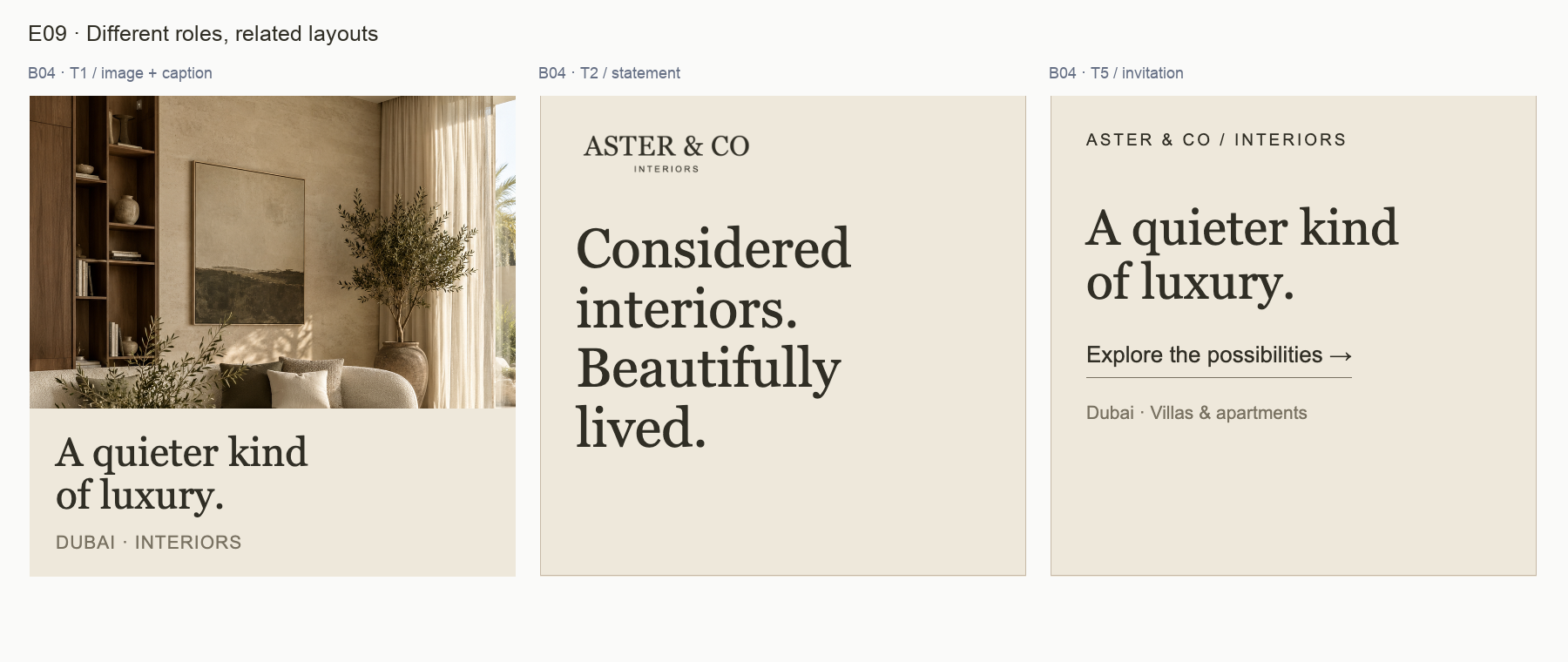
A deliberate exception has a reason someone can say out loud and keeps the cues people recognize you by: the name treatment, main colors, type voice. Drift looks like a near-miss of the original. The green is almost the green, nobody owns it and it spreads by being copied. If nobody can say why something is different, treat it as drift.
Words drift too. The same studio’s sample Creative Audit looks at three paid ads and finds three action labels: ‘Explore the possibilities’, ‘Discover more’ and ‘Learn more’. Its finding, ‘Align action language across the paid creative set’, sits next to a strength it wants kept: Preserve recognisable identity cues without forcing identical layouts. That’s a sensible default for most brands: hold the meaning steady and let the layout flex.
What brand inconsistency costs a business
Plenty of articles claim consistency lifts revenue by some precise percentage. We won’t repeat those figures, because none we’ve seen traces back to a study a reader could check. The real costs are plainer.
Recognition
People recognize a business by seeing the same cues repeatedly. If the van, the yard sign and the Facebook ad use three greens and two logos, each sighting does less work. Someone who saw your van all summer is less likely to connect it with your ad.
Perceived care
Inconsistency shows at moments of trust. A homeowner comparing three roofing quotes notices the one with the stretched logo. It proves nothing about the roof, but it’s the only evidence of care in front of them.
Time spent re-explaining the brand
This is the cost owners feel most and count least. Every new freelancer, printer or agency has to be told which file, green and font, often after the first draft comes back wrong. Say you brief six vendors a year, each brief takes two hours of your time at $60 an hour, and each costs one extra revision round billed at $90. That’s 6 × ($120 + $90) = $1,260 a year before anyone counts a reprint, and it repeats until the source is fixed.
Find the drift with evidence before you fix it
The usual mistake is fixing from memory. Someone says the colors are all over the place, a designer tidies up, and three weeks later there’s a fourth green. A fix needs a list of specific inconsistencies, each tied to the file where it appears, so you can see which are everywhere and which are one-offs.
That means reviewing materials as they went out: the exported posts, the quote as a client receives it, the ad at the size it runs. The guideline PDF shows what was intended; the exports show what happened.
This is where a Brand Audit or Complete Design Review from Prooflin fits. You upload exported materials as PNG, JPG, WebP or selected PDF pages, and the report ties each inconsistency to the files it appears in, with a severity, a priority from P1 Immediate to P5 Monitor and a confidence level. Each report opens as a draft for a person to review. In the sample Brand Audit for Aster & Co, the palette itself is recorded as a strength. The opportunity is making the supporting choices repeatable, so the next designer doesn’t have to guess:
Make supporting color choices repeatable
Why it matters
The note field fits the warm direction, and the supplied pairing is intentional. The open question is how future authors choose supporting fills and decide when smaller essential text should stay in Ink.
Recommended response
Name the pale note surface as an approved supporting fill or document how it derives from the palette. Narrow Soft ink’s role by testing the actual smallest labels, and keep essential information in Ink when readability is uncertain.
How to verify
Review the color sheet and one final-size social export together. A designer should be able to select the note fill and label color without sampling a screenshot or inventing a new neutral.
That last line, about sampling a screenshot, names the mechanism behind most color drift. The sample Logo Audit makes the same case in ‘A short usage guide would prevent avoidable drift’, and the Brand Audit’s ‘Formalize a small family of layouts’ heads off template mutation. For an agency inheriting a client’s brand, it’s also a dated record of what you were handed; the agency use case covers delivering it under your own brand.
How to fix inconsistent branding without redoing everything
You rarely need to fix everything at once. Work in this order:
- Fix what’s seen and copied most. Rank touchpoints by how many people see them and how often they’re reproduced: website header, social profile, post template, email signature, quote template. One corrected template fixes every future piece made from it.
- Stop the source of the drift. Keep approved exports in one place, named for what each file is for, and move retired files out of reach. Write down color values for screen and print. Make sure the brand font is installed on every machine that produces anything, or agree a fallback. Give each template one owner.
- Replace long-lived items on their natural cycle. Van wraps, signage and stationery are expensive. Swap them when they’re next due, unless they carry something wrong, like an old phone number.
- Leave legacy one-offs for last. The old event flyer and the brochure PDF nobody has opened in two years can wait.
Step two is the one teams skip, which is why fixes don’t stick. Guidance prevents drift only if people can find the answer when they need it, and a hundred-page PDF rarely manages that. IntensePath’s piece on brand guidelines written as decisions people actually face covers why manuals go unread and what to write instead. For the logo, a tested small-size version removes a lot of bad guesses; setting a logo minimum size shows how to arrive at one.
Resist the rebrand as a fix. If the identity is sound, and in many drifted brands it is, a new logo just adds another version to the shared folder. The Aster & Co sample reaches that verdict too: keep the identity, approve a focused rules update. If you can’t tell drift from a genuine identity problem, what a brand audit includes explains which questions need customer research.
What to do this week
Gather what went out in the last few months, as exported or printed, not the masters on the designer’s drive. Then answer three questions: which touchpoints do the most people see, where did each off-brand version come from, and who owns the folder and templates from now on.
If the answer to the last one is nobody, fix that first. Then get the most-seen touchpoints reviewed, by your designer or with an evidence-led report. To see what one looks like, the Aster & Co sample reports show Logo, Brand and Creative Audits and a Complete Design Review of the same fictional studio.