Why logo debates turn into taste debates
Taste arguments aren’t silly. They happen because nobody wrote down what the logo is for, so every opinion carries the same weight. The founder sees her name. The sales lead sees the proposal cover. Whoever runs social media sees a 40px circle in a comment thread. Each of them is judging a different logo, because each is picturing a different use.
The same thing happens with a logo that has been around for years. Someone says it feels off, and everyone nods without knowing what they’re agreeing to. That’s a symptom. It might mean the wordmark turns to mush in the mobile header, or that the only white version has a box around it, or that two competitors have launched something similar. Each has a different fix, and only one of them is a redesign.
Nobody wins that argument. The way out is to swap it for questions that have answers.
Agree the job before anyone says “I like it”
Before the concepts go up, or before anyone critiques the current logo, get four things agreed in writing. A paragraph the decision maker has approved is enough.
- What the logo has to do. Identify the business, signal the category, sit quietly on a premium proposal, stand out on a van. Pick the two that matter most.
- Where it will live. List the real placements, smallest first: browser tab, social avatar, mobile header, email signature, invoice, shop sign, embroidered polo. Cross off the ones the business will never use.
- Who it’s for, in the brief’s own words. “Calm, premium, warm” points somewhere very different from “quick, local, affordable”.
- What settles a disagreement. A concept that fails a listed placement loses, and preference only chooses between concepts that pass.
That last agreement does most of the work. Once the room accepts that a mark which vanishes on the dark email footer is out, nobody has to defend or attack blue. Agree who signs off, too. Five people can give input; one person decides.
How to evaluate a logo design where it will actually live
A logo centered on a white artboard is the one view no customer will ever have. Knowing how to evaluate a logo design mostly means knowing which contexts to put it in, what failure looks like there, and what evidence settles it.
The smallest real uses
Every logo eventually gets shrunk into a browser tab, a social avatar or a mobile header shared with a menu button. Failure looks like a descriptor line that turns into a gray smear, or thin strokes that fade out. The evidence is the logo at its actual rendered size, seen at 100% on the device. Watch for padded export files, too: transparent space around the artwork can mean a “300px logo” shows far less logo than the number suggests. Thresholds are a topic of their own, covered in how small a logo can go before it needs a separate version.
Dark backgrounds and one color
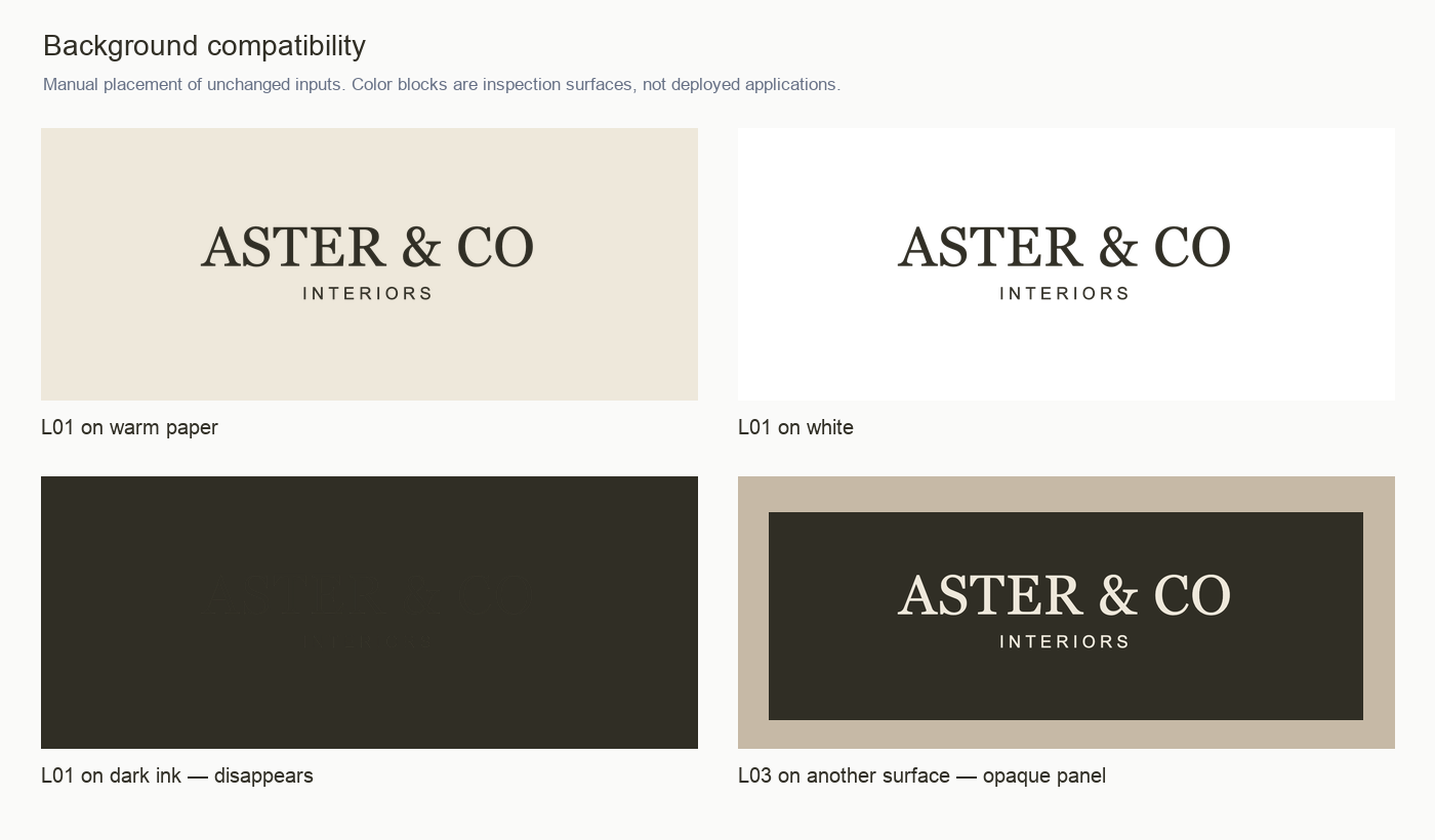
Put the files the business actually has on the surfaces it actually uses: a dark website footer, a photograph, a one-color invoice, an email opened in dark mode. Failure looks like the dark logo disappearing on a dark field, or a “reversed” version that is really the logo on a solid rectangle. For stamps, embroidery or one-ink print, failure is a mark that needs a gradient or two similar colors to separate its parts. The evidence is hard to argue with: the logo on that surface, side by side with the alternatives.
Square and round crops
Most social platforms mask profile pictures to a circle, and favicons and app icons are square. A long horizontal wordmark can’t fill either shape, so the real question is what goes in the circle. Failure looks like the full lockup shrunk to an unreadable line, or an icon cropped so tightly the mask clips its edges. Good looks like an approved square mark with deliberate padding that still reads at feed size.
Fit to the audience and the brief
This is where taste tries to sneak back in, so hold it to the brief. If the brief said calm, premium and warm, a restrained serif with a quiet descriptor fits, and a heavy italic slab with a lightning bolt doesn’t, whoever likes it. Be honest about what kind of judgment this is. Prooflin’s sample Logo Audit scores “Fit to supplied scenario” at 86 and labels it “qualitative fit, not audience evidence”. That’s the right register for a reviewer who hasn’t spoken to a single customer.
Distinctiveness within the category
A logo can be well drawn and still look like everyone else’s. Plenty of local categories recycle the same few ideas: the roofline, the leaf, the tooth, the monogram in a circle. The evidence is the category itself, meaning the concept placed next to the logos your customers see when they compare options, at the same size. Without that comparison, nobody can honestly call a mark distinctive, the reviewer included.
If you want this review done thoroughly and written down, that’s what Prooflin’s Logo Audit is for. It works from exported logo files (PNG, JPG, WebP or PDF) plus whatever you record about the business, audience and goals in the Project notes, and it covers legibility, scalability, variants and distinctiveness as far as the supplied files can show them, tying each finding to a specific file. The sample Logo Audit for a fictional Dubai interiors studio reviews three logo files and records 10 findings and a 76/100 overall assessment, with strengths listed beside problems. It doesn’t redesign logos or search trademarks, and every report opens as a draft your team reviews before anyone else sees it. The guide to preparing images and PDF pages for a design audit explains which variants to upload.
How to evaluate a logo design in writing: findings instead of adjectives
“The icon feels a bit off” has never ended a meeting. A finding can, because other people can check it. A finding is an observation about a named file, tied to a named use, with an action and a way to confirm it’s done. Here’s a minor one from the sample Logo Audit.
The icon’s lower corners deserve an optical cleanup
What we observed
The outer vertical strokes extend to the baseline while the horizontal stroke stops at their centerlines. At a large inspection scale, this creates a slight step at the lower outer corners. The inner uprights also meet a heavier horizontal base, making the bottom visually denser than the arch crown.
Why it matters
The mismatch is minor at ordinary avatar sizes but becomes more apparent on large proposal covers, signage studies or enlarged presentations. A premium identity benefits from deliberate joins, especially in an otherwise very simple symbol.
Recommended response
Resolve the lower joins as one intentional contour and compare the base weight against the outer arch. Make optical adjustments at both large and small sizes; do not flatten the whole icon simply to remove the corner detail.
Completion check
Inspect the revised silhouette on a plain background at a large scale, then at 32–64px. Confirm no projecting shoulder or unintended dark knot remains at the lower joins.
Look at what it avoids. It never calls the icon clumsy. It names the geometry, says where the problem will show, and warns against overcorrecting. It’s rated Low severity and P3 (Planned) because it’s real but not urgent. Anyone who disagrees now has to disagree with something they can go and look at.
Strengths need the same treatment, and most reviews skip them. The report’s first finding is “The wordmark establishes a calm, considered hierarchy”, and a later one records that “The two wordmarks form a consistent visual pair”. When a refresh starts, a written list of strengths is what stops a team from “fixing” the parts that already work.
Priority needs discipline too. One heading from the sample report is worth borrowing: “Priority is about sequence, not alarm.” Its P2 items deal with visible problems in common uses and come before any broad rollout, P3 items add polish or make usage repeatable, P4 marks the strengths to preserve, and nothing is P1. Framed that way, ten findings read as a work order rather than a verdict on anyone’s taste.
Common logo design mistakes that only show up after launch
Most logo problems are invisible in the presentation deck. They turn up in the first month of real production:
- A missing light version, or a fake one: the only “white logo” is the logo baked onto a dark rectangle, which looks like a sticker on every photo. The sample audit’s finding “The supplied set does not cover every background” describes this pattern.
- A tagline or descriptor that can’t survive shrinking. Elegant in the deck, noise in an email signature.
- Detail that only shows when enlarged. Joins nobody noticed at 200px become obvious on a two-meter sign.
- An abstract icon used alone from day one, before anyone connects it with the business name.
- Files with no rules attached, so the website, the van and the proposal template each pick a different size, crop and background.
None of these is a matter of taste. Each one appears in a specific placement, so each could have been caught by trying that placement before launch. When the logo is one of several things drifting apart, start with inconsistent branding across your channels instead.
What a logo evaluation can’t settle
Be clear about the edges. Overclaiming here is how a sensible review loses the room.
Trademark clearance is a legal question. Whether a mark can be registered, or conflicts with someone else’s, depends on searches and legal judgment in the markets where you trade. No design review answers it, Prooflin’s included. Talk to a trademark professional before you commit to signage or vehicle wraps.
How customers will feel needs research. A reviewer can say a mark fits a written brief. Nobody can tell from the artwork alone that your customers will find it trustworthy or memorable; that takes research with real people. The sample Logo Audit lists memorability, market distinctiveness and audience preference as not scored, rather than treating missing evidence as a zero.
Print production is the third edge. Screen files can’t tell you how a fine line holds up in thread or on a printer’s stock. A physical proof can.
What to do before the next logo meeting
Write the one-paragraph job description for the logo and get the decision maker to approve it. List the real placements, smallest first, and gather the files in use today, including the one somebody quietly made for the email signature. Agree, before any concept goes up, that failing a listed placement beats a preference.
Then have the evaluation done by someone who’ll write findings rather than reactions: your designer, a second designer with no stake in the concepts, or a Prooflin Logo Audit that someone on your side reviews before it’s shared. Expect evidence for each finding, strengths next to problems, priorities that describe order, and a plain list of what wasn’t assessed. If the logo question turns out to be a brand question, read what a brand audit covers and which parts need customer research.