Why ugly ads work when they do
The story told after the test is simple: the polished ad lost, so polish was the problem. It’s satisfying, and usually wrong. List what else changed between the two ads. The scrappy one almost always did several things the expensive one didn’t, and none of them required ugliness.
- It looks like it belongs in the feed. A handheld video or plain captioned photo reads as a post rather than an interruption, so people give it a second look.
- The offer arrives in the first second. “Free measure and quote this week” in a text box beats a mood that takes three slides to reach a point.
- The hook is readable at the size it’s shown. Big, plain words on a flat part of the frame, not a thin serif laid across a sofa.
- There’s a real face or real proof. Someone who works there, a finished job, the product in a hand.
- It asks for one thing, and that thing matches the objective. A campaign optimizing for enquiries gets an ad that says “send us your floor plan”, not “discover more”.
Lo-fi ad creative tends to pick up those traits by accident. Shoot on a phone in ten minutes and there’s no budget for atmosphere, so the person on camera just says what they sell and what to do next. The studio shoot had a moodboard and a stylist, and somewhere along the way the offer ended up in small type on the third card.
So the useful lesson is narrower than the trend: the production can be rough, but the message can’t be vague.
Do polished ads perform worse, or do they just say less?
The trend doesn’t rest on controlled evidence that polished ads perform worse as a class. What circulates is anecdote, and it’s skewed: winners get shared, flops don’t. Only your own campaign data tells you what performed for your offer and your audience.
What you can say is smaller. Polished creative often gives its most prominent space to mood, then sets the facts a buyer needs (what the service is, where, for whom, what happens next) smaller underneath. That’s a hierarchy decision, and it can be fixed without making anything uglier.
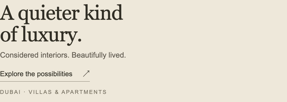
Prooflin’s sample Creative Audit for a fictional interiors studio shows this well, and it’s a fair example because the artwork is genuinely good. The feed creative’s largest line is “A quieter kind of luxury.” The words that tell a homeowner whether this is for them, Dubai villas and apartments, sit in the smallest line on the panel, and the action is “Explore the possibilities”. The report gives the pattern across the whole set a blunt name, Essential information is often secondary, and its advice is to promote that information before adding more words. The photography stays.
No phone camera required. The fix is moving the service statement up and rewriting the action.
When ugly ads just look cheap
Rough production fails at predictable points, mostly the same ones as polished ads. It just has less goodwill in reserve, so each failure costs more.
The trend posts skip that last row. A pizza place can post a phone video and nobody worries. A renovation contractor asking for a five-figure job can’t be so casual, because the creative is part of the evidence that they’re careful. Rough can still work there if it shows a real site, a real tradesperson and a clear next step. Rough and vague has nothing holding it up.
On the brand row: a deliberately scrappy series still needs a few fixed cues, such as the same name said out loud, one color and a recurring face. Without them it slides into the problem described in why a business ends up looking like three different companies, only faster.
Is it the offer or the execution?
Before anyone rebriefs the designer, settle which problem you have. An offer problem means the proposition isn’t attractive enough to this audience at this price and this level of commitment. An execution problem means the proposition is fine but the ad doesn’t get it across. Making an ad uglier can only ever fix the second kind.
Creative gets blamed first because it’s visible and quick to change, while the offer belongs to whoever sets prices and terms. IntensePath’s piece on recognizing when the offer, not the creative, is the real problem is worth reading before you commission new concepts. It treats the offer as the whole exchange, including what the buyer is asked to give up and the risk they take on, and it makes a point worth borrowing: when genuinely different treatments perform about the same, the creative probably isn’t the variable.
Why ugly ads work on a strong offer and fail on a weak one
A lo-fi ad is mostly a vehicle for one sentence. If that sentence is “Free design consultation, we’ll come to you this week”, plain delivery helps, because nothing stands between the viewer and a good deal. If the sentence is “Quality interiors, get in touch”, no camera style rescues it. That’s why the same “make it ugly” brief works brilliantly for one advertiser and does nothing for the next.
A few questions, answered from data you already have, usually settle it:
- Did different styles land close together? If the studio ad and the selfie ad performed within a whisker of each other, look at the offer.
- Where does the drop happen? Weak click-through with a healthy landing-page conversion rate points at the ad. Healthy clicks with poor conversion point at the page, the offer, or a mismatch between them.
- Did the winner say something the loser didn’t? Read both scripts as plain text. If the scrappy one named a price, a deadline or a specific service and the polished one didn’t, it wasn’t the lighting.
- Were they judged on the same outcome? A cheap-looking ad that wins on cost per lead and loses on lead quality hasn’t won anything. Weighing lead quality against cost per lead covers how to score that properly.
- Was it a fair comparison? Different audiences, budgets, placements or weeks can manufacture a winner.
Judge it against the objective, not the polish
Why ugly ads work in one account and flop in the next comes down to fit. Ask of any creative, phone-shot or studio-built, whether it does the job the campaign is paying for, judged against the objective and the audience and only against those.
That’s the premise of Prooflin’s Creative Audit. It reviews exported ad and social creative for message, CTA and platform fit against the audience and goals written in the Project notes, and the questions don’t change because a file came from a phone. The sample Creative Audit for a fictional interiors studio covers three images and one PDF page, with 15 findings and an overall 73/100. Its most useful findings have nothing to do with style. One is “Replace the feed’s exploratory CTA with a clear enquiry action”. Another, for the 300 × 250 display banner, is “Simplify the banner’s smallest text and action treatment”, because at native size the message asks the viewer to piece together several small fragments. The report rates that one low confidence, since it only had a flat file to judge from.
Align action language across the paid creative set
What is visible
The feed says “Explore the possibilities,” the story says “Discover more,” and the display banner says “Learn more.” None names the consultation-enquiry goal supplied in the brief.
Why it matters
A shared action meaning helps each format lead into the same kind of conversation. The words can be shortened for space without sending conflicting expectations to the destination.
Exact next step · R13
Adopt “Enquire about a consultation” as the full action phrase, with “Enquire” for the constrained banner where the service message already supplies context. Keep booking language conditional on a booking destination.
Read that with the “make it uglier” brief in mind. A rough re-shoot with the same three labels would carry the same problem straight into the feed, while a polished version that says “Enquire about a consultation” wouldn’t. On platforms such as Meta ads, the button under the image is chosen from a fixed list at setup, so make sure it and the artwork promise the same next step.
What to tell the client who asks why they pay for design
When a client asks why ugly ads work and what they’re paying a designer for, the honest answer is that the brief was the problem. “Make it uglier” is an instruction about surface. What the client watched win was a clearer message in a native format, and design is how you get that on purpose.
A good designer can make a lo-fi ad deliberately: a big caption on a flat area of the frame, the offer in the first line, the face and the product in shot, one action, and the brand shown or said early. That’s still design work. It just stops spending the budget on surfaces the viewer scrolls straight past.
Stop scoring creative on the numbers that flatter it, too. A rough ad with a high click-through rate and no enquiries isn’t a winner. Leading the report with actionable metrics instead of vanity ones keeps the conversation on what the campaign was for.
What to do before the next creative round
None of this needs a new shoot. It needs an hour with the current ads and whoever owns the offer.
- Write each live ad’s message as one plain sentence without looking at the visuals. If you can’t, the ad can’t either.
- Put the winner and the loser side by side and list every difference besides production style, starting with the offer, the first line and the action.
- Look at each ad on a phone at real size, and confirm its action matches the campaign objective and what the landing page offers.
- Agree with the client whether the offer itself is open to change before anyone is rebriefed.
- Keep at least one fixed brand cue in anything you shoot rough.