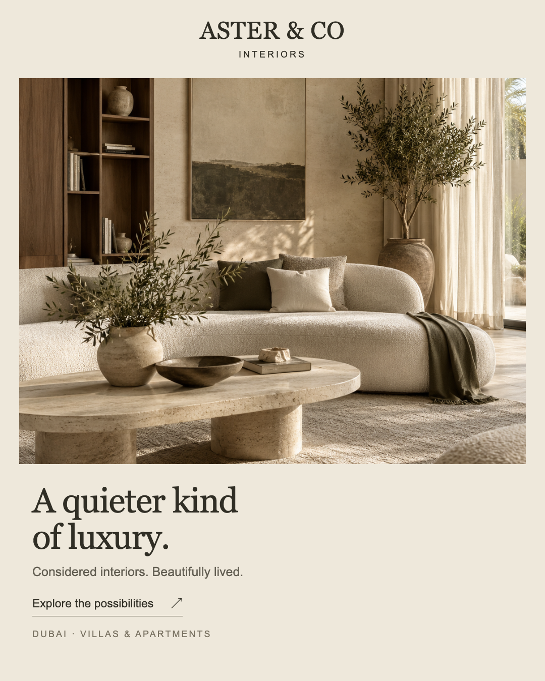
Portrait feed creative
A strong room image, with the service left in the margins.
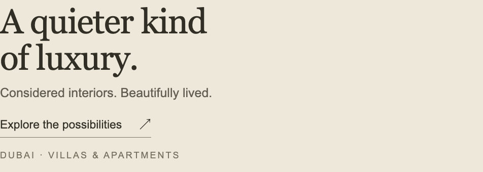
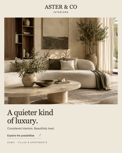
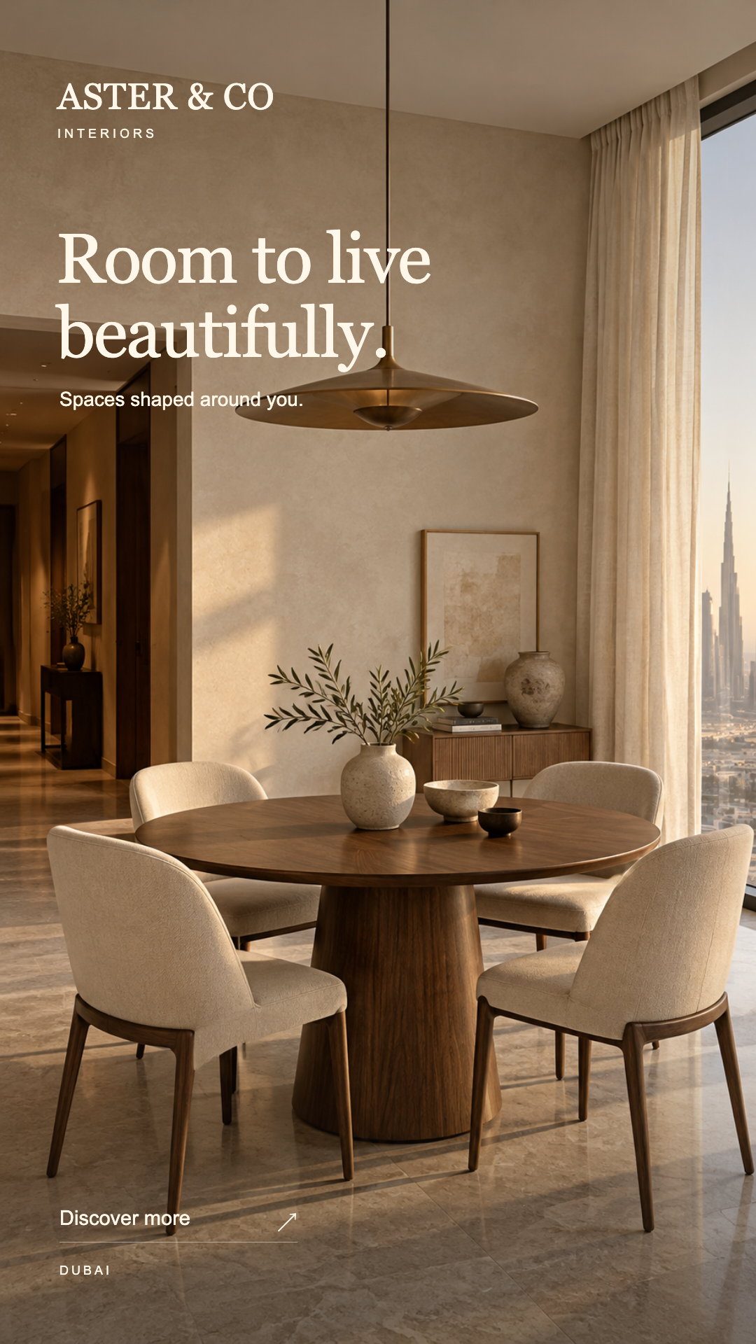
The cream frame, generous image and large serif headline create a calm opening. The photograph has a clear foreground, tactile materials and an uncluttered palette. The design feels intentional at full size, and its copy sits on a plain panel rather than competing with the room.
The hierarchy gives most of the space to atmosphere. “A quieter kind of luxury” is memorable as a tone, but it does not explain what Aster can be contacted about. “Interiors” and the villa/apartment descriptor supply that context in much smaller type. At the 390px-wide inspection size, the main headline stays easy to read while the service and location line requires closer attention. The problem is unequal emphasis, not an absence of information.
Keep the room, cream border and one serif headline. Move “Villa & apartment interiors in Dubai” into the main reading path, then make a consultation enquiry the explicit next step. Shorten supporting copy to create space for a more legible action treatment. The source is a flat image: the underlined arrow is a visual cue, not a tested link.
Visible message · transcription
ASTER & CO / INTERIORS / A quieter kind of luxury. / Considered interiors. Beautifully lived. / Explore the possibilities ↗ / DUBAI · VILLAS & APARTMENTS
No post caption, native platform CTA or destination was supplied. The assessment does not infer how those missing elements might complete the message.
D01: complete source at 390px wide; D03: untouched lower-copy crop.