One visual direction. Clearer decisions across logo, brand and creative.
Selected source crops: working brand board and feed creative.
PREPARED FOR
Aster & Co Interiors Dubai · Interior design studio
REPORT DETAILS
11 October 2026 · Version 1.0 ASTER-CD-2026-01 · Four visual units
Authored review of selected sample materials. Three distinct assessment dimensions, with one consolidated customer action plan. No live engine result is represented.
PROOFLIN / Complete Design Review
A strong identity needs a more explicit invitation
The selected materials share a warm, restrained visual direction. The most useful changes are practical: protect the logo descriptor at small sizes, make the feed’s service explanation easier to find and connect its invitation to a clear next step. The evidence supports refinement of the application, rather than replacing the identity.
LOGO
77 / 100
Clear foundation; size and framing need decisions.
BRAND
85 / 100
Coherent direction; supporting rules can be more precise.
CREATIVE
74 / 100
Strong visual order; service and CTA can work harder.
These are separate authored assessments of the scopes described below. They are not averaged into a grand score and are not copied results from earlier standalone audits.
Three decisions to make
Explain the offer near the headline. Test a clear service/location line while retaining the chosen brand signature. C02 / R04.
Choose the next step before its label. Match enquiry or exploration wording to the real destination. C03 / R05.
Check what survives reduction. Review the logo descriptor and functional creative copy separately at their intended sizes. L02, C04.
Five strengths and six opportunities. No critical or high-severity issue is established. The seven recommendations consolidate related work while retaining the dimension and source behind each conclusion.
PROOFLIN / Complete Design Review
One selected set, three review dimensions
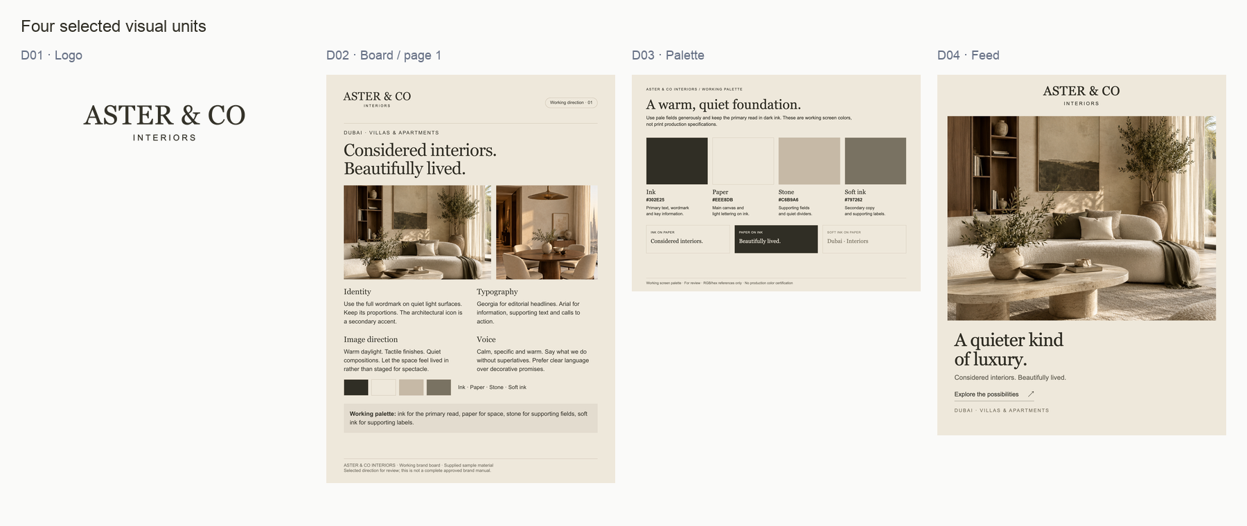
This review uses four visual units from the established Aster sample: primary logo PNG, working brand board PDF page 1, palette PNG and feed creative PNG. All three dimensions consider the same selected set. Each conclusion is limited to the subjects and functions actually visible.
Dimension
Relevant assessment
Boundary
Logo
D01 standalone mark; the visible identity applications in D02 and D04.
D03 has no assessable logo subject. Its document heading is not treated as the primary logo artwork.
Brand
Relationships among D01–D04: identity, palette, type, imagery and message.
Consistency is assessed within this small set, not across every Aster channel.
Creative
D04 as a communication asset, with D01–D03 providing identity/reference context.
The reference sheets and standalone logo are not scored as failed advertisements.
Why this selection is useful
The inputs connect an identity, working guidance and one real exported composition. They fit within one four-unit review group, so the report can compare them directly without claiming comparisons across separate batches. Four is the current per-batch boundary, not a claim that every audit is limited to four total assets.
Context and origin
The scenario is a Dubai interior design studio with a warm, premium, calm direction. The artwork is authored sample material; room scenes are AI-generated examples, not completed client projects. No live account, campaign or website was captured.
Existing icon, reverse logo, typography study, grid, story, banner and brochure assets are outside this selection. They are not claimed missing from the brand. Earlier recommendations remain proposals; the copied originals are unchanged.
PROOFLIN / Complete Design Review
The exact source inventory
Four selected source units. The thumbnails define scope; the individual reviews and linked originals provide the readable detail. Open full-size view ↗
Each original is a byte-identical copy of an existing approved sample input. The board preview is rendered at 100dpi from its selected PDF page. Inspection crops and size studies are derived views, not additional review inputs.
No montage adds unseen documents to the review. No source is silently exchanged between dimensions, and no proposed revision is shown as current evidence.
PROOFLIN / Complete Design Review
What each source can and cannot answer
Source
Logo dimension
Brand / Creative dimensions
D01 · Primary logo
Assessable · high confidence in visible form and alpha bounds. Small-size behavior is limited to the manual raster study.
Brand: identity reference. Creative: no campaign message or CTA to score; the file is a logo, not a failed ad.
D02 · Board page 1
Assessable in context · medium confidence for the displayed wordmark. It is not a substitute for production vector inspection.
Brand: working guidance, palette, type, voice and imagery. Creative: document communication/context, not evidence of a live advertisement.
D03 · Palette
Not Scored · no identifiable logo artwork. Quality is not assessable; the informational studio heading does not establish logo geometry.
Brand: named colors, roles and pairs. Creative: reference-sheet context; no campaign objective or destination is expected.
D04 · Feed
Assessable in context · medium confidence for name/descriptor hierarchy. No separate production logo file is inferred from it.
Brand: selected application. Creative: assessable message, hierarchy, CTA wording and size behavior; live performance is unavailable.
Not Scored is not zero
D03 contributes no logo-quality score. Confidence that the logo subject is absent is different from confidence in assessing a logo’s quality. The relevant evidence can still support a Brand conclusion without being repurposed into an unsupported Logo judgment.
Missing context narrows the conclusion
No caption, destination, actual feed rendering, vector artwork or print proof was supplied. Those gaps limit specific claims; they do not erase supported observations in the selected files.
The coverage table accounts for all four sources across the three dimensions. Relevance varies by dimension; the selected inputs themselves do not change.
PROOFLIN / Complete Design Review
Separate scores for separate decisions
Each dimension score is an independent qualitative judgment of the selected evidence. The values are authored for this review, not measured engine outputs, market benchmarks or a combined formula.
Dimension
Score and scope
Evidence and interpretation
Logo clarity and application
77 / 100 D01 plus visible applications in D02/D04. D03 excluded from logo quality.
High confidence in D01 form and framing; medium for application fit. Clear hierarchy is offset by descriptor fragility and ambiguous file-width sizing. L01–L03.
Brand coherence
85 / 100 D01–D04 as one selected system.
High confidence in stated palette/type continuity; medium for aesthetic fit. Warm, coherent choices with supporting-role decisions to document. B01–B04.
Creative communication readiness
74 / 100 D04, informed by D01–D03 context.
Medium confidence overall. Clear image-led order, but service explanation, CTA intent and small text warrant refinement. C01–C04.
How to read the scale
80–100: strong within the reviewed scope. 60–79: a useful foundation with refinements. 40–59: substantial limitations. Below 40: major concerns. Small point differences should not determine the work plan.
No grand total
Logo, Brand and Creative answer different questions. An attractive, coherent brand can still need a clearer enquiry message. Averaging those results would hide the distinction. The executive priorities are editorial consolidation of the findings, not a fourth assessment dimension.
Not scored: brand recognition, legal clearance, competitive uniqueness, audience preference, ad performance, live conversion, platform approval and certified print output. Missing evidence is not a numerical penalty.
PROOFLIN / Complete Design Review
How the conclusions fit together
Visible relationship
Practical implication
Keep the distinction
A restrained identity with a small descriptor
Protect the descriptor at its actual placement size.
Logo advice concerns reproduction; it does not require a louder brand style. L02 / R01.
A coherent brand line with an atmospheric headline
Add service clarity where the communication goal needs it.
The core line can remain a brand signature even when a creative uses a more explicit supporting line. B02 / C02 / R04.
Quiet colors with understated functional text
Check the smallest essential text before approving output.
A visual strength can create a use constraint. No blanket palette replacement or unmeasured contrast failure is implied. B03 / C04.
An exploratory invitation in a calm composition
Select wording based on the actual next step.
An enquiry label is appropriate only for an enquiry destination. C03 / R05.
Consolidation without losing attribution
The report keeps Logo, Brand and Creative findings distinct. Shared strengths are carried into R07 once; copy and size recommendations retain their own checks. The action plan is organized around decisions a designer and studio owner can make together.
What has not been inferred
A missing item in this selection is not evidence that the brand lacks it. A working board is meaningful guidance, even though it does not answer every production question. One feed composition cannot prove consistency across an entire campaign or channel library.
Use the evidence, confidence and limits alongside each finding when deciding what to change. A score alone does not establish priority.
The transparent source contains the serif ASTER & CO name above a smaller, spaced INTERIORS descriptor. Visible ink bounds are 894 × 199px inside a 1600 × 560px canvas.
Assessment
The hierarchy works at generous scale. The main application questions are descriptor legibility and the difference between file width and visible artwork width.
Scope: Use as the identity reference for L01–L03. Icon and reverse variants are outside this review, not absent from the brand.
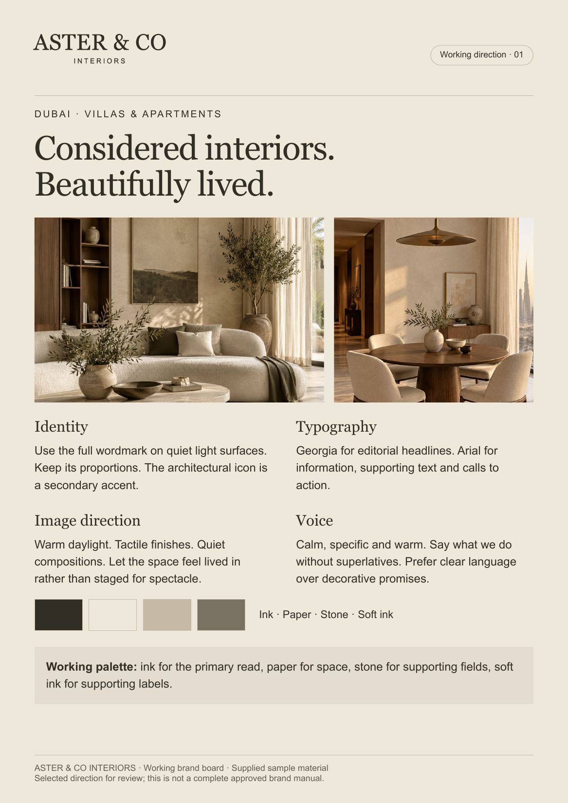
The board supplies a full wordmark, core line, two room images, palette and concise identity, typography, imagery and voice instructions. It names Georgia and Arial roles.
Assessment
This is substantive working guidance. It connects the desired atmosphere to concrete examples, while leaving some supporting-surface and final-size decisions open.
Scope: Use as context across all dimensions. Its pictured logo is assessable in context; its guidance is not a live website, approved full manual or campaign result.
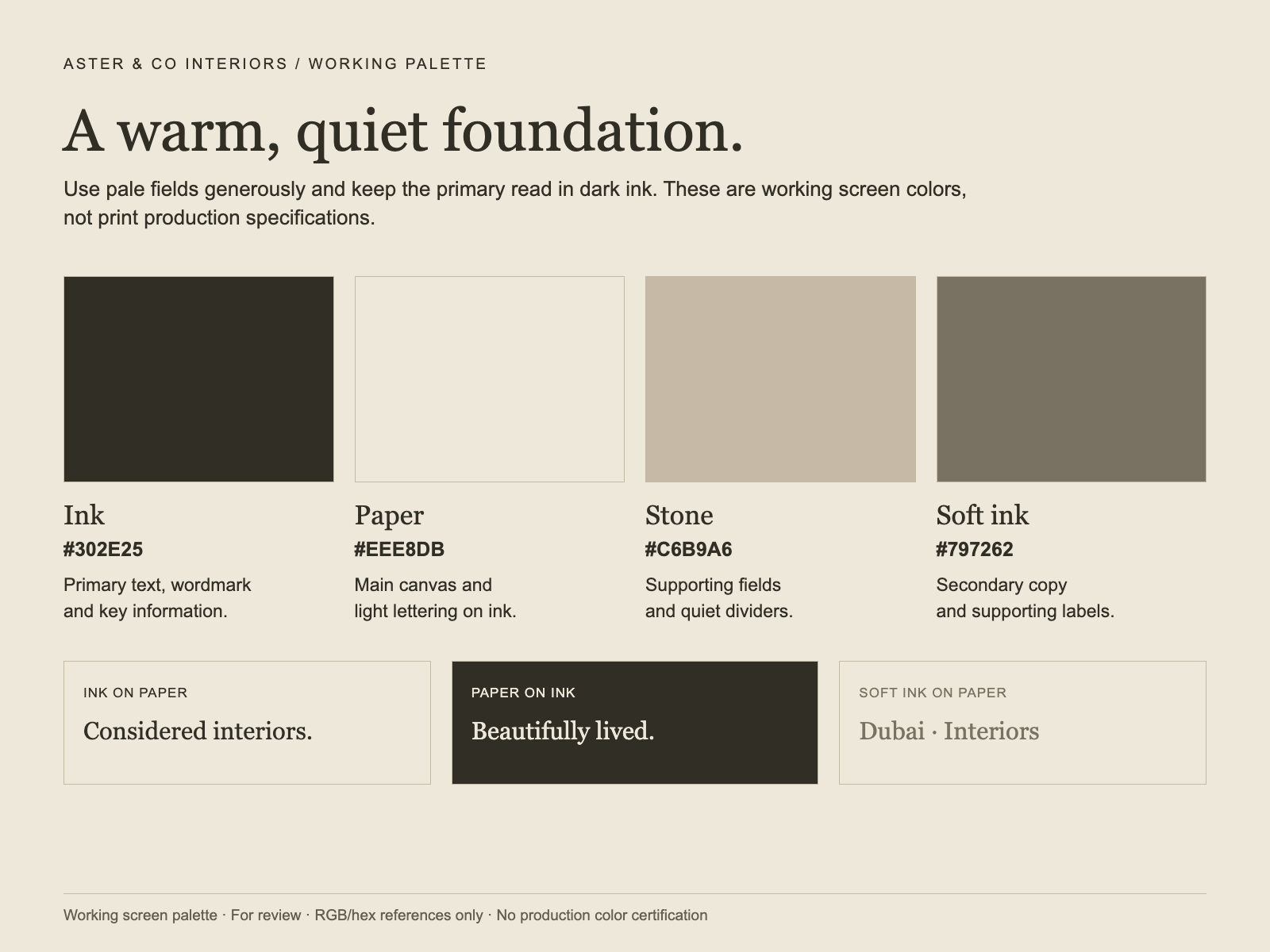
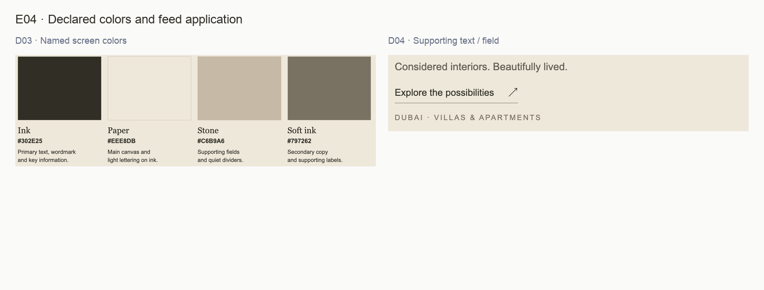
Four colors are named with hex values and roles. Three reading pairs demonstrate Ink on Paper, Paper on Ink and Soft ink on Paper. The top studio label identifies the reference sheet.
Assessment
The palette is defined and useful. Supporting text and pale surface decisions can be more repeatable. There is no identifiable primary logo artwork to score here.
Scope: Use for Brand color assessment. Mark Logo quality Not Scored. Do not demand an advertising CTA from a palette reference.
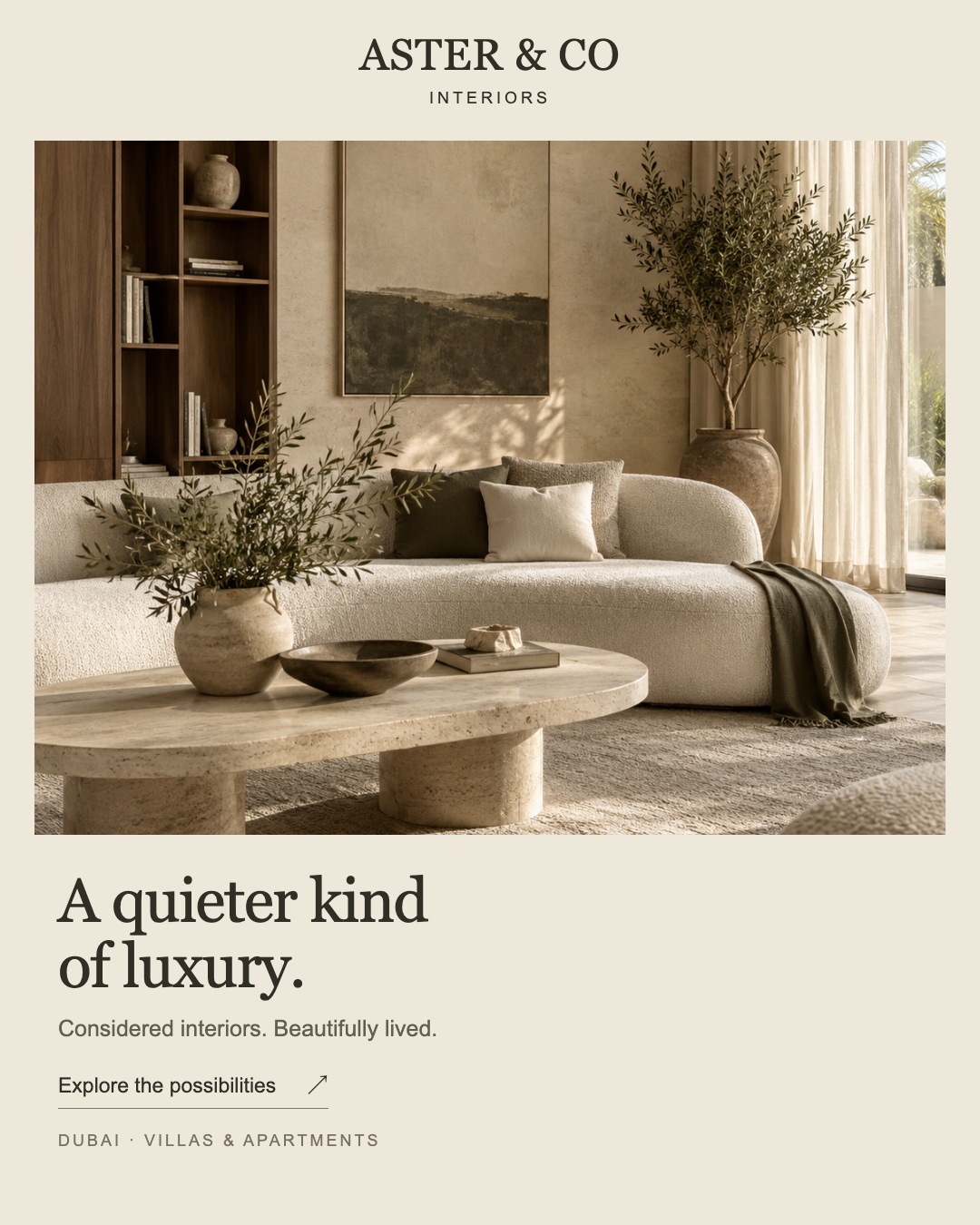
The portrait creative presents the studio name, a large room scene, “A quieter kind of luxury.”, the core line, an exploratory CTA and Dubai/villas/apartments context.
Assessment
The composition is disciplined and consistent with the board. Its communication can become more explicit without replacing the image-led layout or the visual identity.
Scope: Use for contextual Logo/Brand review and the Creative assessment. No live caption, destination, platform processing or performance data is included.
PROOFLIN / Complete Design Review
Faithful views, with their limits
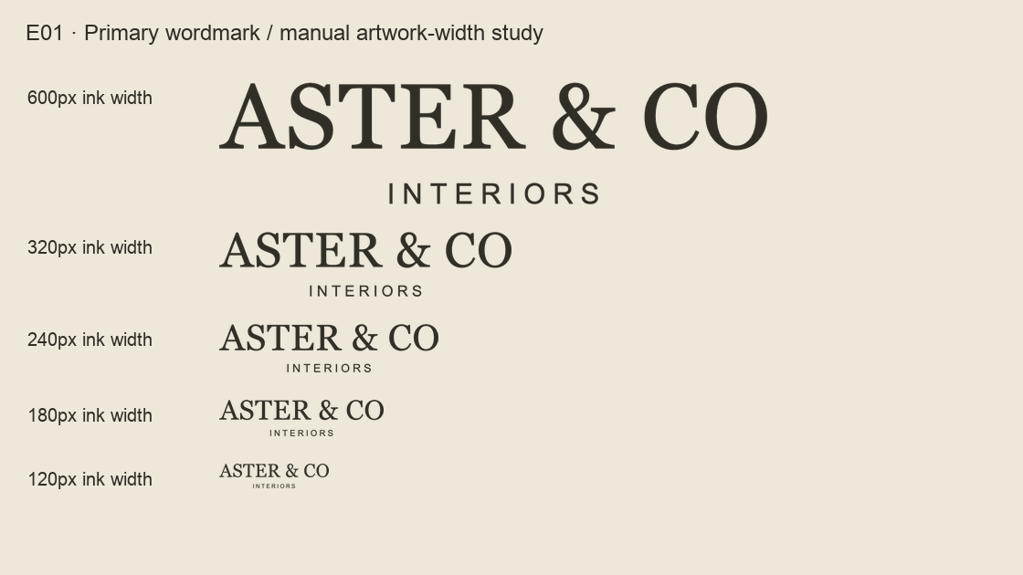
E01 · D01 cropped to visible ink and resampled at five widths. Open at 100% for the labeled raster sizes; the report itself may scale the board. Open full-size view ↗
What the inspection aids do
The size and framing boards make specific reproduction questions visible. Other evidence views compare source regions side by side or show the feed at 360px width. Labels and neutral board space are added for explanation; the underlying artwork is not redrawn.
What they cannot establish
They are not platform screenshots, redesigned exports, automatic mockups or a certified accessibility test. Resampling, device size and viewing distance affect appearance. The final intended placement remains the acceptance context.
The original source gallery is the reference if a cropped view omits surrounding material. Crop coordinates and authoring provenance are retained privately; the public appendix identifies source and transformation.
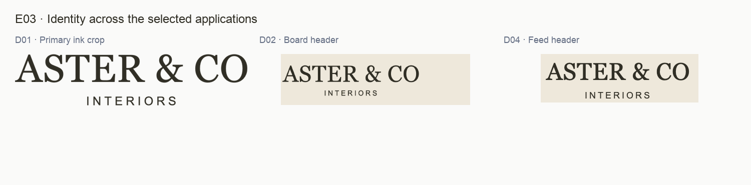
E03 · Source inspection for L01. Full originals retain the surrounding context. Open full-size view ↗
What the evidence shows
The selected primary wordmark gives ASTER & CO clear emphasis above a smaller, spaced INTERIORS descriptor. The board and feed repeat the same name/service relationship in restrained dark type on pale fields.
Why it matters
The identity can introduce the studio without competing with the room imagery or editorial headline. This is a visible relationship across the selected applications, not a claim that every application is a pixel-identical export.
Recommended response
Retain the dominant name, quieter descriptor and calm light-surface treatment. Use the supplied primary artwork as the reference when preparing placement-ready exports.
How to verify
Compare a final export with D01 at equivalent visible artwork width. Confirm the name, descriptor and relative emphasis remain intact without stretching or retyping the logo.
Limit: D03 is a palette sheet with no identifiable logo to judge. Icon geometry, reverse exports, legal distinctiveness and recognition are outside this selection.
PROOFLIN / Logo finding
L02 · Protect the descriptor as the mark becomes small
E01 · Source inspection for L02. Full originals retain the surrounding context. Open full-size view ↗
What the evidence shows
In the manual artwork-width study, the name remains dominant while the thin INTERIORS descriptor becomes very small at the 180px and 120px examples. The 320px example gives the descriptor more room; this is an inspection aid, not an approved minimum.
Why it matters
The descriptor carries the category information. Reducing the whole lockup without checking that line can preserve the name while making its service meaning hard to read.
Recommended response
Test the primary mark at the actual intended size and choose a minimum based on the descriptor. For constrained uses, review an appropriate existing variant separately rather than assuming the full lockup works everywhere.
How to verify
Inspect at 100% on the intended device or document. Ask a reviewer to read both lines without zoom. Record the approved artwork width and the context in which it was tested.
Limit: These are raster resamples on a quiet light field, not live headers, print proofs or platform uploads. The existing icon is outside this selection; it is not claimed missing.
PROOFLIN / Logo finding
L03 · Distinguish file width from visible artwork width
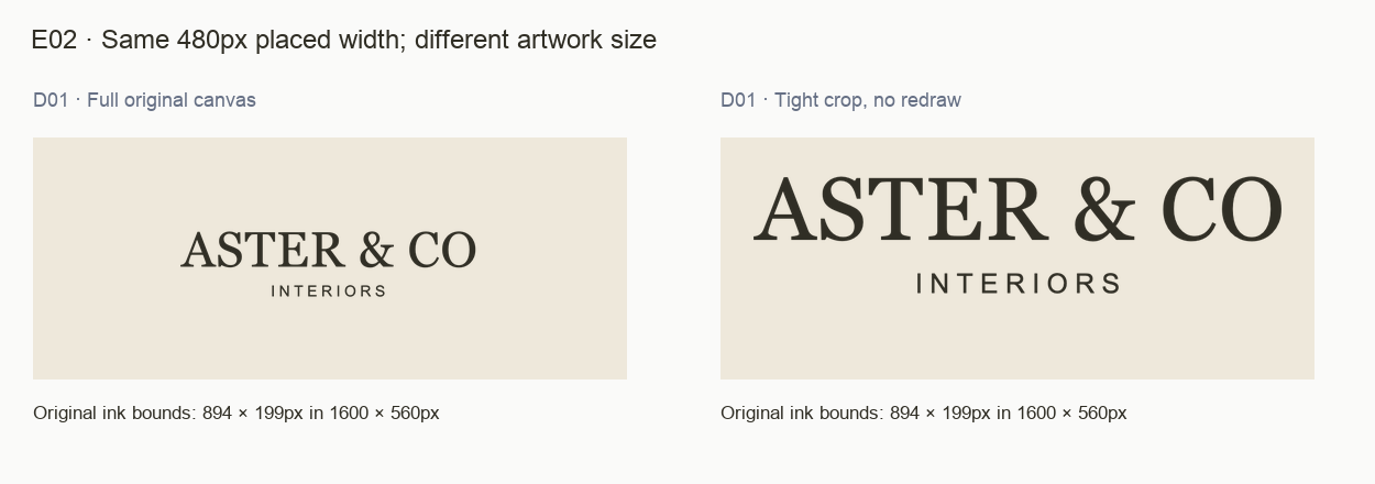
E02 · Source inspection for L03. Full originals retain the surrounding context. Open full-size view ↗
What the evidence shows
The transparent PNG is 1600 × 560px. Its visible ink occupies 894 × 199px, about 56% of the canvas width. At a 480px placed file width, the uncropped logo therefore has about 268px of visible ink; the tight-crop example uses 480px of visible ink.
Why it matters
An author sizing the file box can unintentionally make the wordmark smaller than expected. Transparent padding is part of the file, but it is not a documented clear-space requirement.
Recommended response
Prepare a placement-ready export with deliberate padding and a separate clear-space rule. Keep the original unchanged. Specify whether a placement instruction refers to file width or visible artwork width.
How to verify
Place the export in a representative header or creative. Check the actual ink width and descriptor legibility, then verify that the final padding still protects the mark.
Limit: The comparison crops transparent margins only; it does not redesign the mark. The proposed export has not been delivered, and no universal clear-space unit is inferred.
PROOFLIN / Brand finding
B01 · The palette connects guidance and application
E04 · Source inspection for B01. Full originals retain the surrounding context. Open full-size view ↗
What the evidence shows
D03 names Ink #302E25, Paper #EEE8DB, Stone #C6B9A6 and Soft ink #797262, with roles and reading pairs. D02 repeats the palette. D04 uses a warm pale field, dark main typography and quieter supporting information alongside related warm room imagery.
Why it matters
The selected creative belongs to the same visual direction as the reference materials. The natural colors in the image extend the atmosphere without requiring every photographic pixel to match a flat swatch.
Recommended response
Preserve the Ink/Paper reading relationship and warm supporting colors. Use the current palette as a decision reference when developing a new application, rather than introducing an accent to solve a copy problem.
How to verify
Compare flat fields and text colors with D03, then review the complete composition. Judge photography by its light, texture and atmosphere rather than by exact swatch matching.
Limit: This is visual coherence in the selected materials, not a calibrated color proof, full-brand compliance verdict or accessibility certification.
PROOFLIN / Brand finding
B02 · The editorial and information layers are coherent
StrengthP4 · InfoHigh confidence
Sources: D02 typography guidance · D04 text area · R07
E06 · Source inspection for B02. Full originals retain the surrounding context. Open full-size view ↗
What the evidence shows
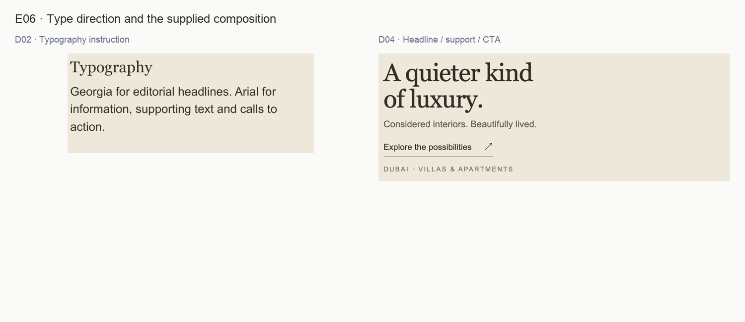
D02 explicitly specifies Georgia for editorial headlines and Arial for information, supporting text and calls to action. D04 visibly separates its large serif headline from its sans-serif brand line, CTA and location/service footline.
Why it matters
The expressive and functional layers have different jobs and are easy to distinguish. The selected evidence does not establish a font-choice inconsistency simply because the headline is much larger.
Recommended response
Keep the two-family division. Adapt line breaks to the format while preserving one main headline. When documenting recurring roles, define their purpose and reading order before choosing sizes.
How to verify
Review the headline, supporting line, CTA and service footline together at final size. Each should have a clear role without needing a new display font.
Limit: Family names come from the supplied board. The separate typography PDF is outside this review, so this finding does not claim that the wider brand lacks a type scale. Font delivery in real channels was not tested.
E05 · Source inspection for B03. Full originals retain the surrounding context. Open full-size view ↗
What the evidence shows
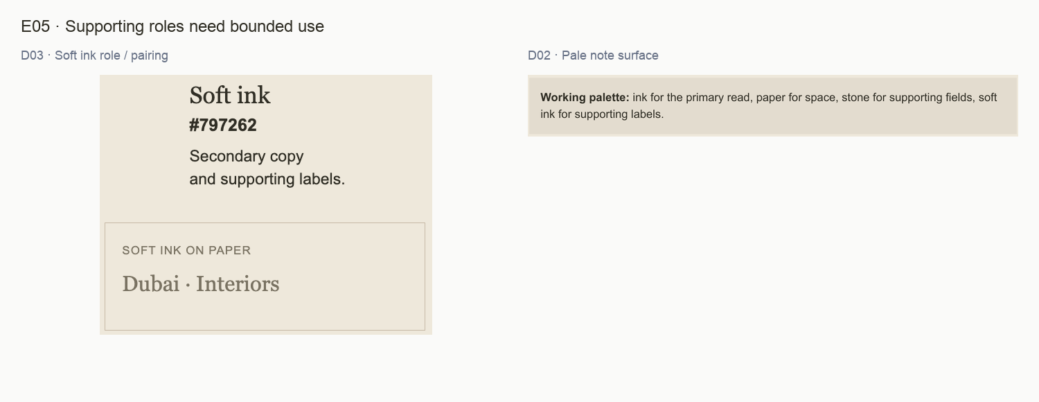
D03 gives Soft ink the broad role “Secondary copy and supporting labels” and demonstrates it on Paper. D02 uses an additional pale note field that is not separately named in its four-swatch key. Both fit the warm visual direction.
Why it matters
The open decision is how another designer should choose a supporting surface or small-text color consistently. The material supplies useful guidance already; it needs a clearer boundary for those choices.
Recommended response
Name or define the note surface. For essential small labels, check the actual size and use Ink when the quieter treatment does not read comfortably. Add an example that shows the chosen role in context.
How to verify
Have another designer reproduce the palette note and a final-size service label from the written guidance, without sampling screenshots or inventing an extra neutral.
Limit: No numerical contrast failure is asserted, and the pale variation is not automatically an error. This finding concerns the selected sheets, not every existing brand document.
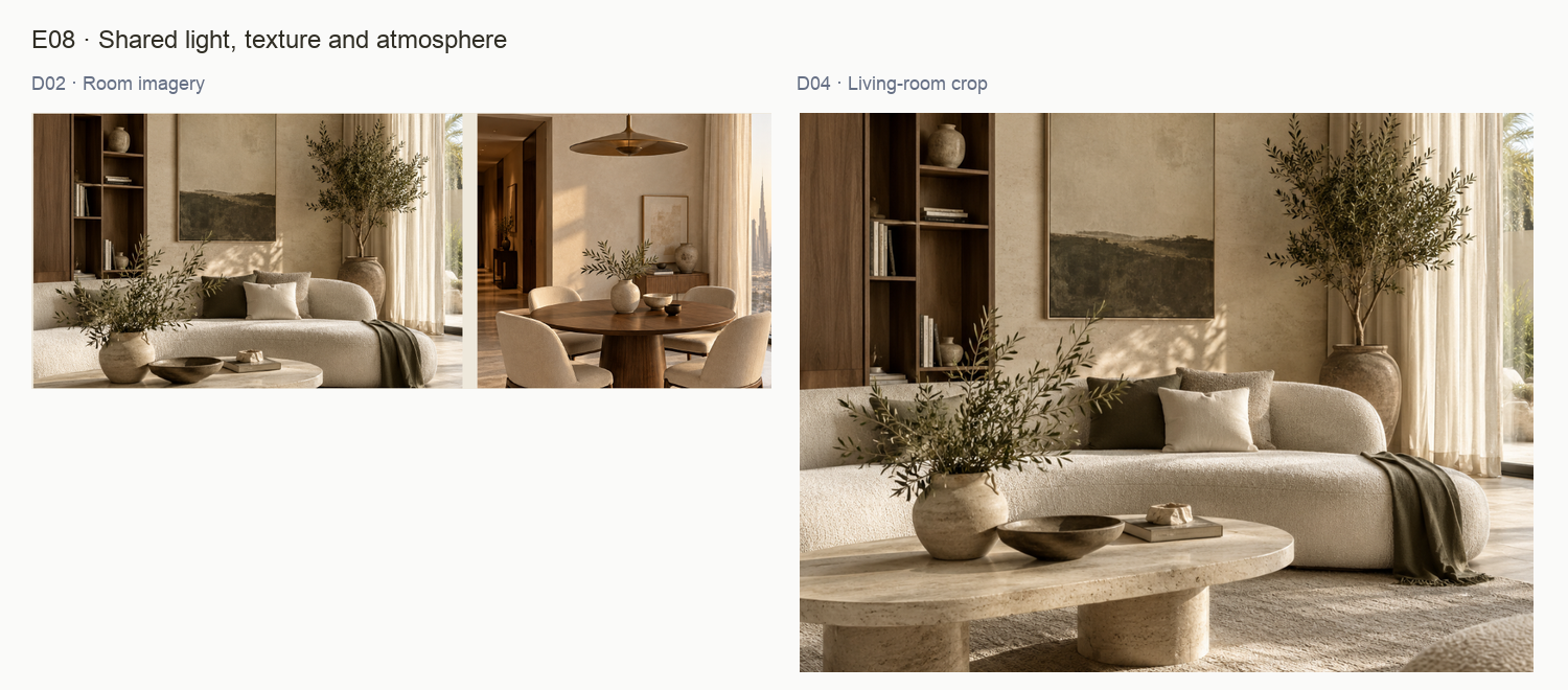
E08 · Source inspection for B04. Full originals retain the surrounding context. Open full-size view ↗
What the evidence shows
D02 calls for warm daylight, tactile finishes and quiet compositions. D04 carries the same living-room scene used in the board, with soft light, textured pale surfaces and restrained styling.
Why it matters
The creative is closely connected to its supplied direction sheet. Reusing the same scene makes that connection visible, while also limiting how much this set can prove about a broader photographic library.
Recommended response
Retain the warm, tactile atmosphere. In future selections, vary subject and framing while preserving the direction. Keep image permission and factual attribution separate from aesthetic approval.
How to verify
Review a later batch of different images together. Confirm that it retains the mood without relying on one repeated room scene and that captions accurately describe the material.
Limit: The room scenes are AI-generated sample imagery, not evidence of completed Aster projects. This set does not prove variety, client trust, audience preference or portfolio credibility.
E10 · Source inspection for C01. Full originals retain the surrounding context. Open full-size view ↗
What the evidence shows
The feed places the studio identity first, gives the room photograph most of the canvas, then groups headline, supporting line, invitation and service/location detail below. It avoids placing its main copy over busy photographic detail.
Why it matters
The order supports a calm introduction and keeps text on a predictable background. The large image communicates atmosphere immediately; the lower block can then explain the offer and next step.
Recommended response
Preserve the image-led structure and separate text field while refining the message. Avoid solving specificity or CTA questions by filling the photograph with more text.
How to verify
Inspect the revised creative at its actual intended viewing size. Confirm that image, headline and next step remain in a clear order, and that any added clarifier fits without crowding.
Limit: Attention and comprehension are qualitative judgments here. No impression, click-through, conversion or platform-approval evidence was supplied.
PROOFLIN / Creative finding
C02 · Bring the service closer to the main message
E07 · Source inspection for C02. Full originals retain the surrounding context. Open full-size view ↗
What the evidence shows
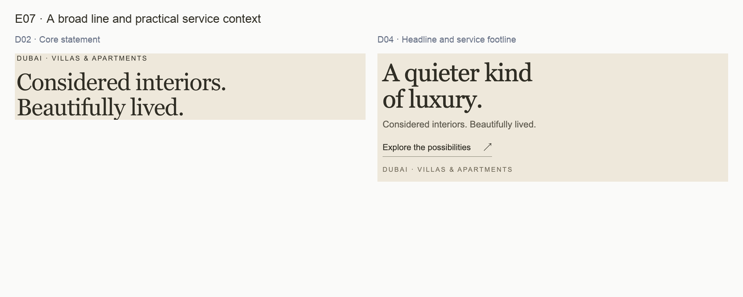
D04 leads with “A quieter kind of luxury.” Its supporting line, “Considered interiors. Beautifully lived.”, reinforces the mood. Practical context appears lower down as “DUBAI · VILLAS & APARTMENTS”; the top logo includes INTERIORS.
Why it matters
The service is not absent, but the main reading block asks a new viewer to connect several separated cues. A more explicit supporting line could explain what the studio does while retaining the atmospheric headline.
Recommended response
Test “Interior design for villas and apartments in Dubai.” as the supporting line when that scope is accurate. Retain the existing core line elsewhere if it remains a chosen brand signature; do not discard it across the system.
How to verify
Show the original and proposed text treatment at the same size. Ask a reviewer unfamiliar with the sample what service is offered and where, without promising a measured performance lift.
Limit: The proposed line is an authored alternative grounded in visible service/location cues. No new service, free offer, delivery promise or real audience-test result is introduced.
E09 · Source inspection for C03. Full originals retain the surrounding context. Open full-size view ↗
What the evidence shows
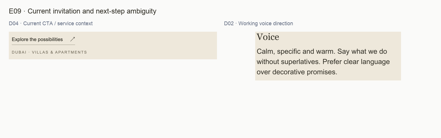
The visible CTA is “Explore the possibilities” with an arrow and underline. It communicates invitation but does not identify whether the next step is project inspiration, a service overview or an enquiry.
Why it matters
The phrase fits the calm tone. For a specific acquisition goal, the wording should also help the reader anticipate what happens next. The source board’s preference for clear, specific language supports that refinement.
Recommended response
Choose the destination first. If it genuinely opens an enquiry, test “Discuss your project”. If it opens an inspiration page, use exploratory wording and make that context clear. Keep the visual treatment restrained.
How to verify
Open the actual destination from the final placement and verify its purpose, copy and available action. Review the CTA together with any native platform button or caption.
Limit: This is a static PNG: the artwork itself has no inspected clickable route. No broken link, live campaign mismatch or conversion outcome is claimed.
E10 · Source inspection for C04. Full originals retain the surrounding context. Open full-size view ↗
What the evidence shows
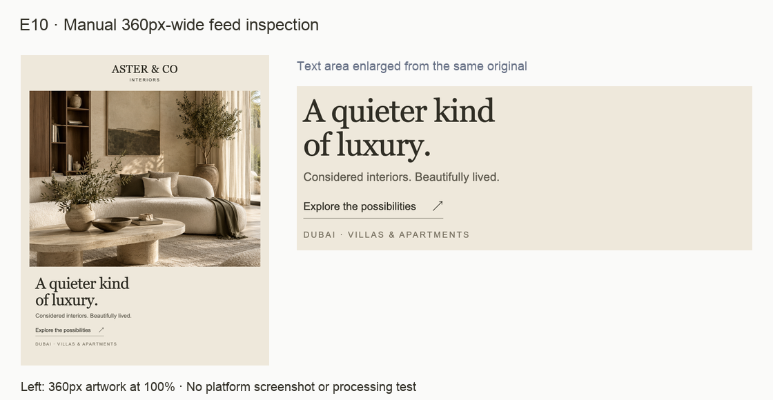
At the manual 360px-wide view, the large headline remains prominent while the supporting line, CTA, descriptor and spaced service footline become much quieter. The source’s generous hierarchy makes the information contrast visible.
Why it matters
Quiet supporting text is a valid style choice, but the service and next step must still be readable in the intended placement. The source canvas size alone does not establish that experience.
Recommended response
Review the smallest essential text after final-size export. Increase size or strengthen color where needed, and simplify competing text before adding elements. Keep the photo and headline hierarchy intact.
How to verify
Inspect the exported creative at 100% and then in the intended platform context. Check both logo descriptor and functional copy, recording separate decisions for each rather than applying one arbitrary minimum.
Limit: The 360px board is a manual resample, not a live feed capture or a formal contrast/accessibility test. Device, zoom and platform processing can change the result.
PROOFLIN / Complete Design Review
First: clarify the communication
Make the service and intended next step explicit before adjusting the creative’s smallest text. These P2 actions address the selected feed’s purpose; they do not replace the brand direction.
P2Easy effort
R04 · Test a more explicit service line
Suggested owner: Copywriter and studio owner
Keep the atmospheric headline and compare the existing brand line with a concise service/location clarifier. Confirm the stated service scope before use.
Deliverable: One original-versus-proposed copy comparison in the unchanged layout.
Done when: A reviewer can explain the service and location from the main text block; the brand line retains a deliberate role.
Effort is a relative planning judgment, not a duration or quote. These are proposed customer actions; no corrected production files or live routes are supplied by the report.
PROOFLIN / Complete Design Review
Then: verify real-size legibility
Logo reproduction and functional creative copy need related but separate checks. Use the final wording and intended placement, with visible artwork width distinguished from file width.
P2Moderate effort
R01 · Test and approve logo placement sizes
Suggested owner: Brand designer
Start from D01 and inspect the descriptor at the intended visible artwork width. Record approved sizes by context; evaluate a suitable existing variant separately for smaller uses.
Deliverable: A placement sheet with final-size examples and explicit artwork-width labels.
Done when: Both name and descriptor are readable in each approved context; unsupported icon/reverse uses remain pending.
After the copy decision, export at the intended dimensions. Inspect descriptor, supporting line, CTA and footline. Adjust text size, color or amount only where needed.
Deliverable: A final-size creative proof and a short record of the smallest-text decisions.
Done when: Necessary context and action remain readable without zoom in the reviewed placement, while the composition stays calm.
Effort is a relative planning judgment, not a duration or quote. These are proposed customer actions; no corrected production files or live routes are supplied by the report.
PROOFLIN / Complete Design Review
Make the supporting rules repeatable
These P3 refinements remove avoidable interpretation from export sizing and palette application. Keep the frozen originals and create any approved derivatives separately.
P3Easy effort
R02 · Prepare a predictable logo export
Suggested owner: Brand designer
Keep D01 unchanged. Create a placement-ready derivative with deliberate padding and document clear space separately from file dimensions.
Deliverable: A named export with canvas dimensions, visible artwork width and a simple usage note.
Done when: A second designer can reproduce the tested placement size without guessing which width was specified.
Effort is a relative planning judgment, not a duration or quote. These are proposed customer actions; no corrected production files or live routes are supplied by the report.
PROOFLIN / Complete Design Review
Retain the foundation while adopting the changes
P4 · Preserve strengths
R07 · Preserve the shared visual foundation
Suggested owner: Studio brand owner
Retain the name/descriptor hierarchy, warm palette, serif/sans roles and image-led structure. Review the focused refinements together before adopting a dated working application guide.
Deliverable: An owner-reviewed application sheet showing retained choices, approved changes and pending channel checks.
Done when: Changes solve the identified use problems without implying a redesign, new portfolio evidence or approval of unreviewed channels.
Owner and copywriter: confirm the service scope, destination and proposed wording (R04–R05).
Designer: prepare the revised creative and test the relevant text and logo at final size (R01, R06).
Brand designer: document export framing and supporting color decisions (R02–R03).
Studio owner: review the changes together, retain the shared strengths and record approved uses (R07).
Resolve disagreements by function: keep atmospheric brand language where atmosphere is the job; make service and action explicit where the creative must introduce an offer. Both can belong to the same system.
PROOFLIN / Complete Design Review
Current and proposed copy, with conditions
The visible source wording is retained below. Proposed alternatives are authored guidance for D04, not text already present in the original or a promise of better measured results.
Current wording
Proposed treatment
Reason and condition
Headline: “A quieter kind of luxury.”
Retain initially.
Preserves the tone and lets the service-line change be assessed without changing every element.
Test: “Interior design for villas and apartments in Dubai.”
Makes the service/location explicit near the headline. Use only if accurate; keep the core line in another deliberate brand role. R04.
CTA: “Explore the possibilities”
For a genuine enquiry route: “Discuss your project”.
Describes a concrete next step without inventing a free offer. Verify the route before adoption. R05.
Same CTA, different intent
For an actual inspiration destination: “Explore interior ideas”.
Conditional alternative to the enquiry label, not an additional competing CTA. Keep current wording if context already makes the next step clear.
Footline: “DUBAI · VILLAS & APARTMENTS”
Retain or shorten only after reviewing the new supporting line.
Avoid unnecessary duplication, but do not remove essential context from a detached placement. R06.
A proposed enquiry version
A quieter kind of luxury. Interior design for villas and apartments in Dubai. Discuss your project →
This is a copy sequence, not a delivered redesigned creative. It assumes an accurate service scope and a working enquiry destination. Do not add project claims, awards, prices, free-consultation language or response-time promises without evidence.
PROOFLIN / Complete Design Review
A focused brief for the customer’s designer
Retain these decisions
Keep the primary name/descriptor hierarchy, Ink/Paper relationship, Georgia editorial voice, Arial information layer and image-led composition. Maintain warm light and tactile materials. The brief does not call for a new identity or an extra accent color.
Produce these reviewed outputs
Output
Required content
Acceptance evidence
Logo placement sheet
Visible artwork widths, intentional export padding and examples of the descriptor at final size.
A reviewer can read both lines in each approved context. R01–R02.
Feed revision
One clear service line and one destination-appropriate CTA, retaining the visual structure.
Original/proposed comparison plus the completed destination check. R04–R05.
Final-size proof
The revised feed with descriptor, support, CTA and footline checked separately.
Readable essential information without zoom in the reviewed placement. R06.
Working-rule addendum
Supporting surface/color decisions and a dated record of retained choices.
Another designer can reproduce the intended treatment. R03 / R07.
Keep version and scope clear
Preserve the supplied originals. Name revised exports separately, record who approved them and identify the contexts actually tested. Do not use this review to certify the excluded icon, reverse mark, other creatives or a live website.
Customer implementation guidance belongs in this report. No editable template, brand-kit generator, automatic mockup or live production change is implied.
PROOFLIN / Complete Design Review
A recheck that follows the evidence
Source integrity: the four original inputs remain unchanged; proposed versions have distinct names.
Assessability: D03 remains Not Scored for logo quality. No missing subject receives a zero or invented replacement.
Logo size: the visible artwork width is recorded, and the descriptor is readable in each approved use.
Service clarity: the final creative explains the actual service and location in its main reading area.
CTA accuracy: the label matches the destination that was opened and checked, including platform context where relevant.
Small text: essential descriptor, support, CTA and service information survive the final-size review.
Brand continuity: refinements preserve the palette, type division, atmosphere and disciplined layout.
Claims and imagery: any real-project version has verified permissions and accurate attribution; sample scenes are not presented as client work.
Owner record: approved outputs, tested contexts and unresolved channel checks are recorded together.
Recheck only the changed area after a local wording or crop adjustment. Recheck the selected system when a shared logo, palette or type rule changes. Newly added assets require their own review; they do not inherit these conclusions.
Actual website behavior, live social processing, real devices, audience response, print reproduction and legal clearance remain separate evidence needs.
D04 resampled to 360px plus an enlarged text crop.
C01 → R07; C04 → R06
Coverage and access
Every selected source appears in the inventory, source reviews and assessability table. Each detailed finding retains its Logo, Brand or Creative attribution. The seven actions consolidate work without merging the dimension scores.
Open the original source gallery for three PNGs and the one-page PDF. Images link to their full-size evidence files. PDF viewer support for relative links varies; the HTML gallery provides dependable original downloads.
All evidence aids derive only from D01–D04. Cropping, resampling and neutral reference labels do not turn them into extra inputs or completed design revisions.
PROOFLIN / Complete Design Review
Method, limitations and final direction
How the review was prepared
The selected originals were copied unchanged and frozen before this assessment. Their visible content, dimensions and relevant relationships were inspected. Faithful crops and raster-size studies support the detailed findings. The report then consolidates the customer work while retaining source and dimension attribution.
How to interpret the result
Scores and priorities are authored judgments. High confidence describes clear visible evidence; medium confidence reflects contextual interpretation. Not Scored means the necessary subject or outcome evidence is absent. There is no averaged grand score and no fourth synthesis engine represented by the executive overview.
Material limits
No live Prooflin engine run, deployed renderer acceptance, campaign analytics, real audience test, platform approval, trademark check or print proof is represented. The same four-unit selection underlies all dimensions. Broader visual comparison across other assets or batches is not claimed. The application’s current renderer is not asserted to reproduce this reference presentation.
What the report delivers
This report delivers a complete assessment, supporting evidence and proposed customer guidance. It does not redesign the logo, implement prior recommendations, create editable templates or modify live channels. The selected materials remain available unchanged.
Recommended direction: retain the identity and visual system. Clarify service and CTA intent, verify final-size legibility and document the supporting export/color decisions. Review those focused changes together before approving new customer-facing uses.
Prooflin · Aster & Co Interiors Complete Design Review ASTER-CD-2026-01 · Version 1.0 · 11 October 2026 End of report