A coherent identity. A clearer system for its next chapter.
Selected crops from the supplied Instagram grid composition.
PREPARED FOR
Aster & Co Interiors Dubai · Interior design studio
REPORT DETAILS
11 October 2026 · Version 1.0 ASTER-BR-2026-01 · Four visual units
Authored sample report. Assessment of original sample materials for the supplied Aster scenario. The scores and analysis are editorial judgments; this is not a live Prooflin engine result.
Four source reviews · Nine findings · Six recommendations Complete evidence, consistency matrix and practical brand guidance.
PROOFLIN / Brand Audit
Keep the direction. Make the rules easier to use.
Aster’s supplied materials already speak in a consistent voice. Warm neutrals, an editorial serif, straightforward supporting type and quietly lit interiors form a credible foundation for the stated premium studio direction. The priority is to make that foundation repeatable as content travels beyond this small set.
OVERALL EDITORIAL ASSESSMENT
84 / 100
Strong direction · practical gaps
Independent authored judgment of the supplied set. Not an average, benchmark or performance prediction.
Recommended decision
Retain the identity, palette and type pairing. Approve a focused rules update covering intent, context, supporting roles and layout families before scaling production.
Where to act first
Clarify the next step. Tie enquiry and exploration language to their intended destinations. F06 / R03.
Protect context outside the grid. Review image-led content as it will actually be seen, including caption or profile context. F07 / R04.
Complete the working rules. Define recurring labels, supporting surfaces and three layout families. F04, F05, F09.
Four strengths and five opportunities. No critical or high-severity issue is established. Two P2 opportunities concern message intent and standalone reuse; three P3 opportunities concern repeatability. Missing channel evidence is not scored as failure.
PROOFLIN / Brand Audit
What was reviewed, and why
The supplied scenario describes a Dubai interior design studio with a warm, elegant, calm and modern direction. Premium homeowners, property investors, boutique hospitality owners and expat families are the stated audience. This is scenario context, not verified customer research.
Visible logo application, color, type, hierarchy, imagery, voice and coherence.
Four visual units
Page 1 of each PDF plus the two PNGs
A bounded comparison of the supplied materials. The grid is one composition containing six tiles.
Interpretation
Faithful crops, comparisons and a manual size board
Specific observations, contextual judgments and proposed working rules.
Origin and status of the materials
These are authored working materials for this sample, not a previously approved comprehensive brand manual. The grid is a sample composition, not a screenshot of a live Instagram account. Earlier logo recommendations have not been implemented in these source materials.
What remains unassessed
No live website, proposal deck, signage, packaging, actual social caption, customer journey, print proof or editable production template was supplied. Market positioning, memorability, trademark clearance, audience preference and conversion impact remain unassessed.
The report can recommend how a designer could extend the working system. It does not deliver an automatic redesign, editable template library or approved brand kit. The guidance is proposed and requires owner review.
PROOFLIN / Brand Audit
Read the scores alongside the evidence
The 0–100 scores are authored qualitative summaries. They are not results from a live engine, calibrated benchmarks or promises of commercial performance. Small point differences should not drive decisions; use the evidence and recommended actions.
Assessment
Score
Reason and confidence
Identity continuity
90
High · Shared wordmark and core line across B01 and B04. F01 / E01.
Palette coherence
89
High · Named working colors align with their visible applications. F02 / E02; supporting rules need refinement.
Typography and hierarchy
82
High · Clear family division; recurring label roles need fuller rules. F03–F04 / E03–E04.
Layout and imagery
86
Medium · Related photographic mood and useful layout variety; formal selection rules are not supplied. F08–F09 / E08–E09.
Message and CTA clarity
78
Medium · Clear context in B03, with intent and standalone-use questions in B04. F06–F07 / E06–E07.
Fit to stated direction
86
Medium · Warm, restrained choices fit the brief; audience response is untested. B01–B04.
Interpretation bands
80–100: strong within reviewed scope. 60–79: useful foundation with refinements. 40–59: substantial limitations. Below 40: major concerns.
Confidence
High: visible or stated in the inputs. Medium: contextual interpretation. Not assessed: required evidence absent.
Overall 84/100 is an independent judgment of this small system, not a calculated category average. Unassessed channels and outcomes receive no score and are not treated as zero.
PROOFLIN / Brand Audit
Four inputs, frozen before the review
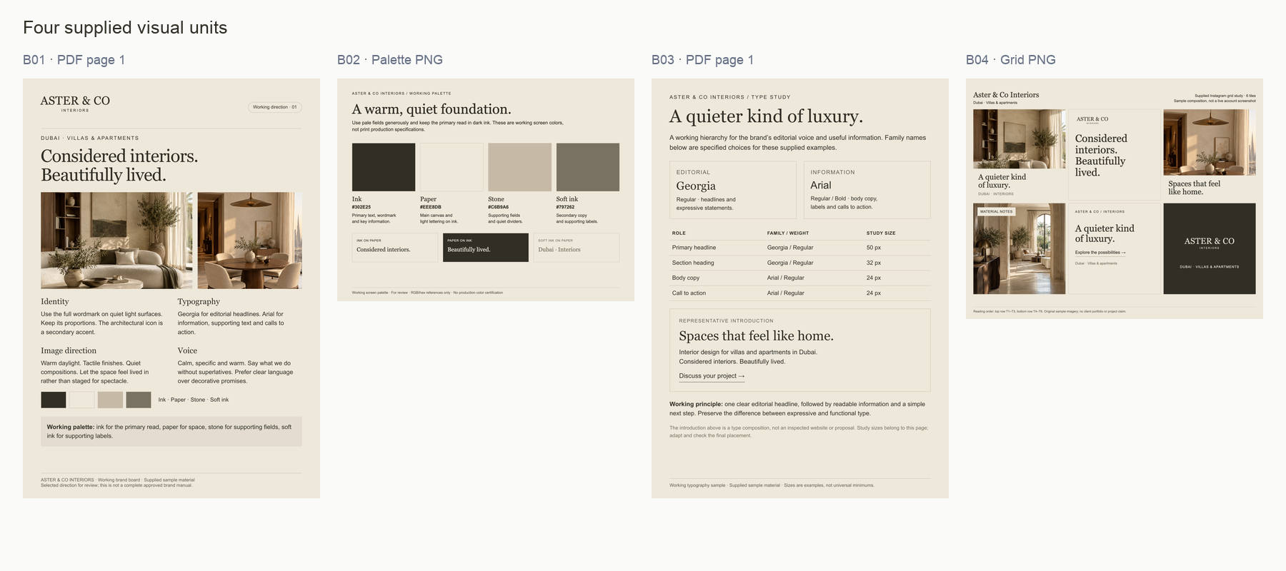
Complete input overview. Thumbnails establish the review boundary; the following pages and source gallery provide readable originals. Open full-size view ↗
The two PDFs are single-page working sheets. Their report previews are rendered at 100dpi; the downloadable originals retain their native PDF content. The grid contains six compositions read left to right, top to bottom: T1–T6.
Evidence crops retain source content and are labeled as manual views. They do not add new input documents, redraw the identity or present proposed revisions as current work.
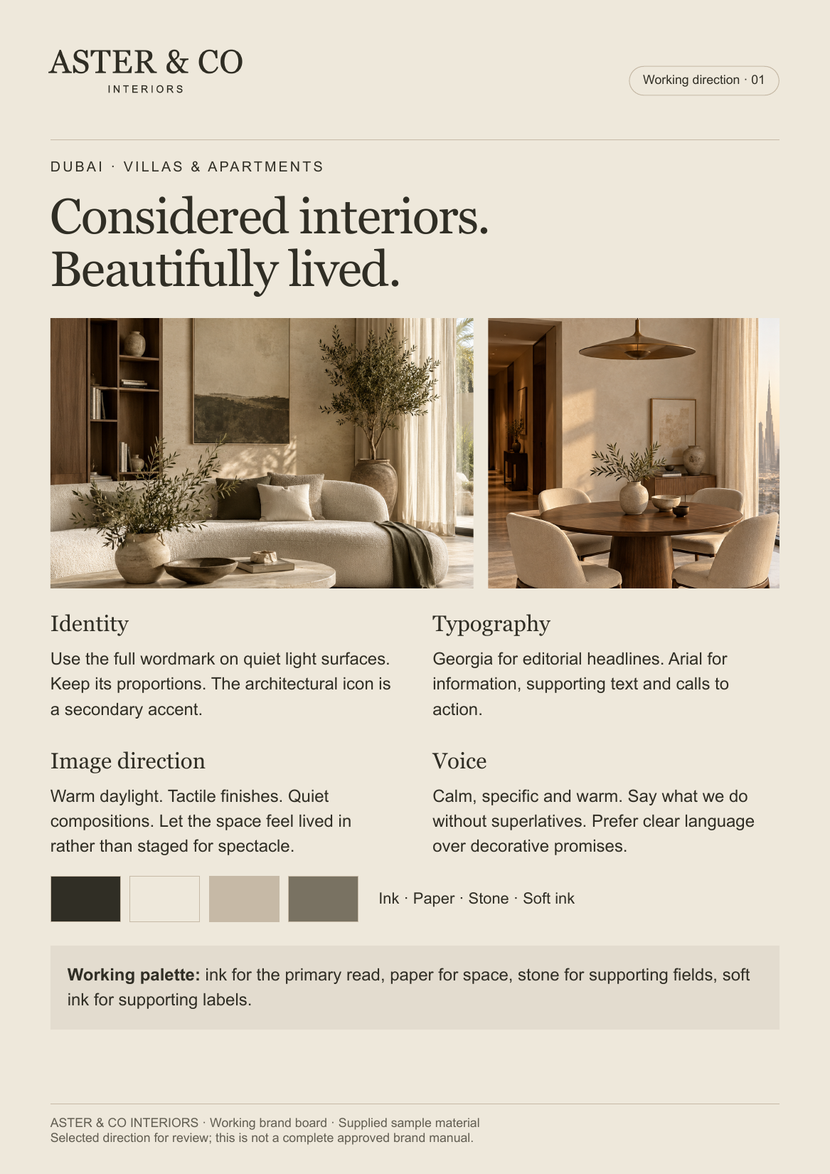
A useful compact direction sheet: full wordmark, core line, room imagery, four colors and concise identity, type, image and voice guidance. The architectural icon is mentioned as a secondary accent but is not illustrated here.
Assessment
The board connects appearance with intent. “Calm, specific and warm” is a useful editorial rule; the warm image examples make that direction tangible. It remains a working sheet, not a complete usage manual.
Next use: Retain as the direction reference. Extend it with approved application rules after reviewing the opportunities in F04–F09.
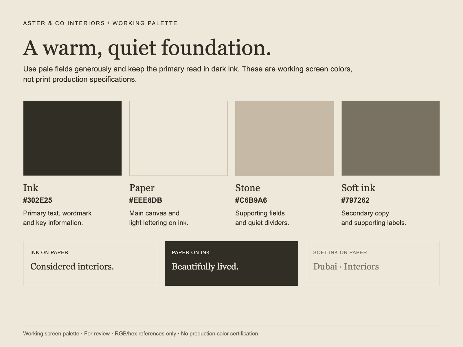
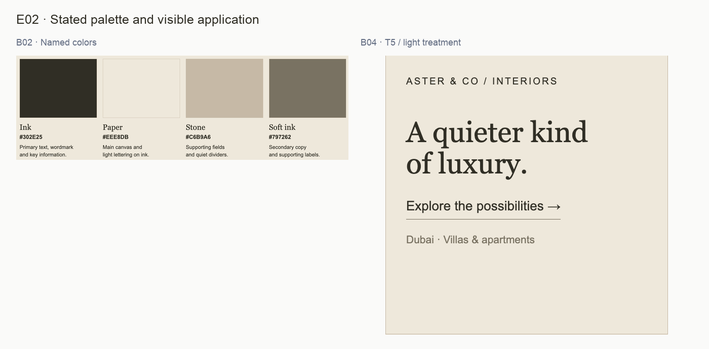
Four screen colors are named with hex values: Ink #302E25, Paper #EEE8DB, Stone #C6B9A6 and Soft ink #797262. Three reading pairs are demonstrated, including Soft ink on Paper.
Assessment
Roles and examples already exist. The next refinement is to define the boundary of supporting text and pale surfaces, not to invent a palette or erase every subtle variation.
Next use: Retain the warm direction. Resolve the supporting-fill and smallest-label decisions in R02. Print specifications require a separate production check.
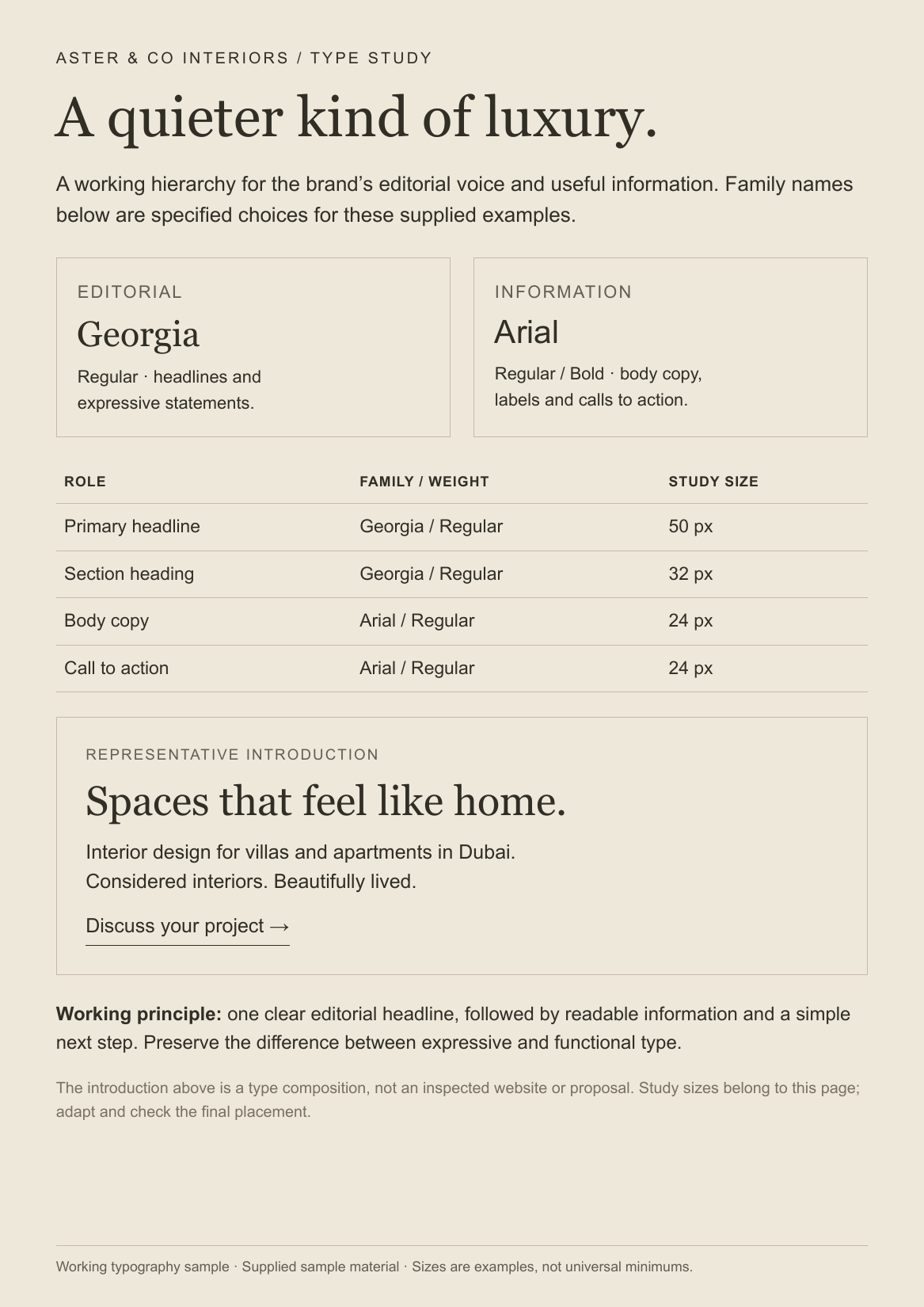
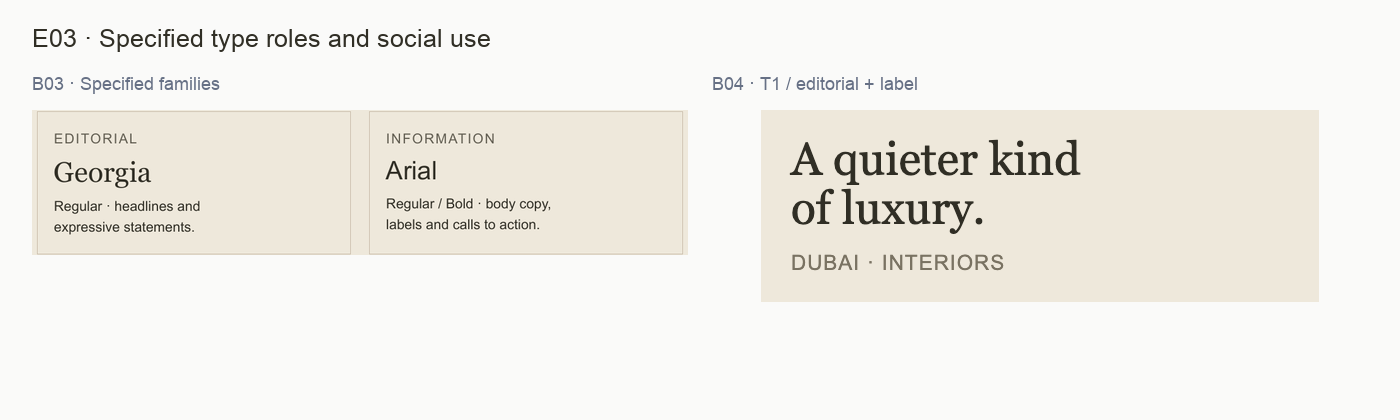
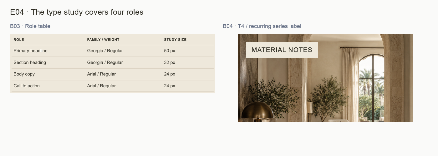
The sheet names Georgia Regular for editorial expression and Arial Regular/Bold for information. Its role table lists 50px headline, 32px section heading and 24px body/CTA study sizes.
Assessment
The representative introduction combines an expressive headline with service/location context and a clear enquiry phrase. These sizes belong to this study; they are not universal rules for every channel.
Next use: Use the hierarchy as the starting point, then add recurring label roles. Connect “Discuss your project” to a real enquiry destination before publication.
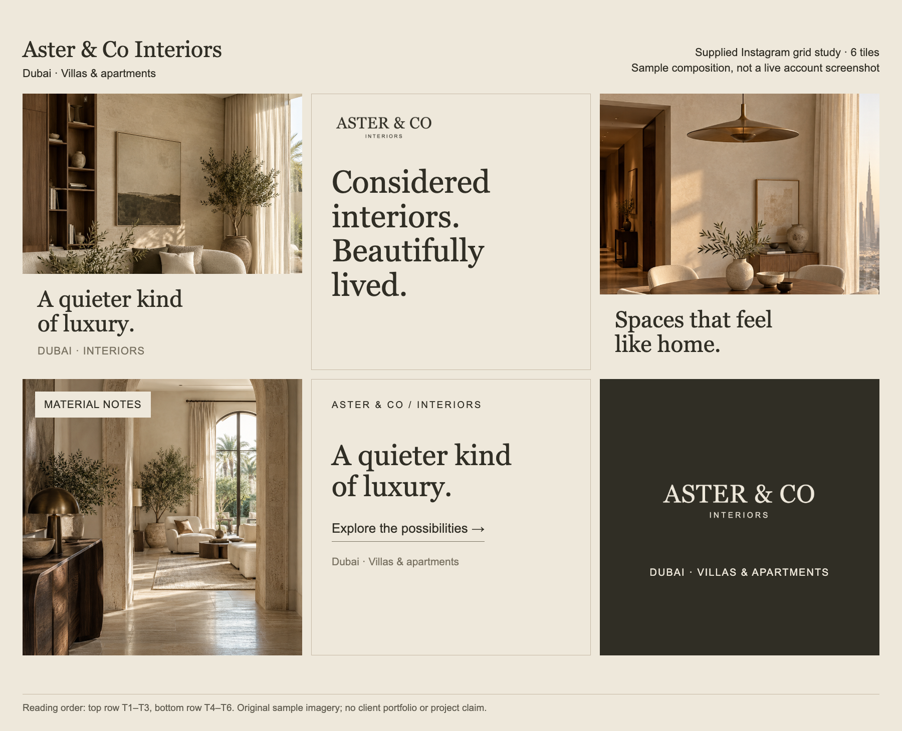
T1 and T3 pair room images with headlines; T2 carries the brand statement; T4 presents a material-themed image label; T5 invites exploration; T6 closes with a dark wordmark panel.
Assessment
The grid alternates image and type intentionally. Its header supplies context for the set. The individual tiles are not complete evidence of live posts, captions or account behavior.
Next use: Keep the rhythm and layout variety. Define family rules and inspect detached uses, especially T3, with the actual caption or surrounding content included.
PROOFLIN / Brand Audit
Consistency does not require sameness
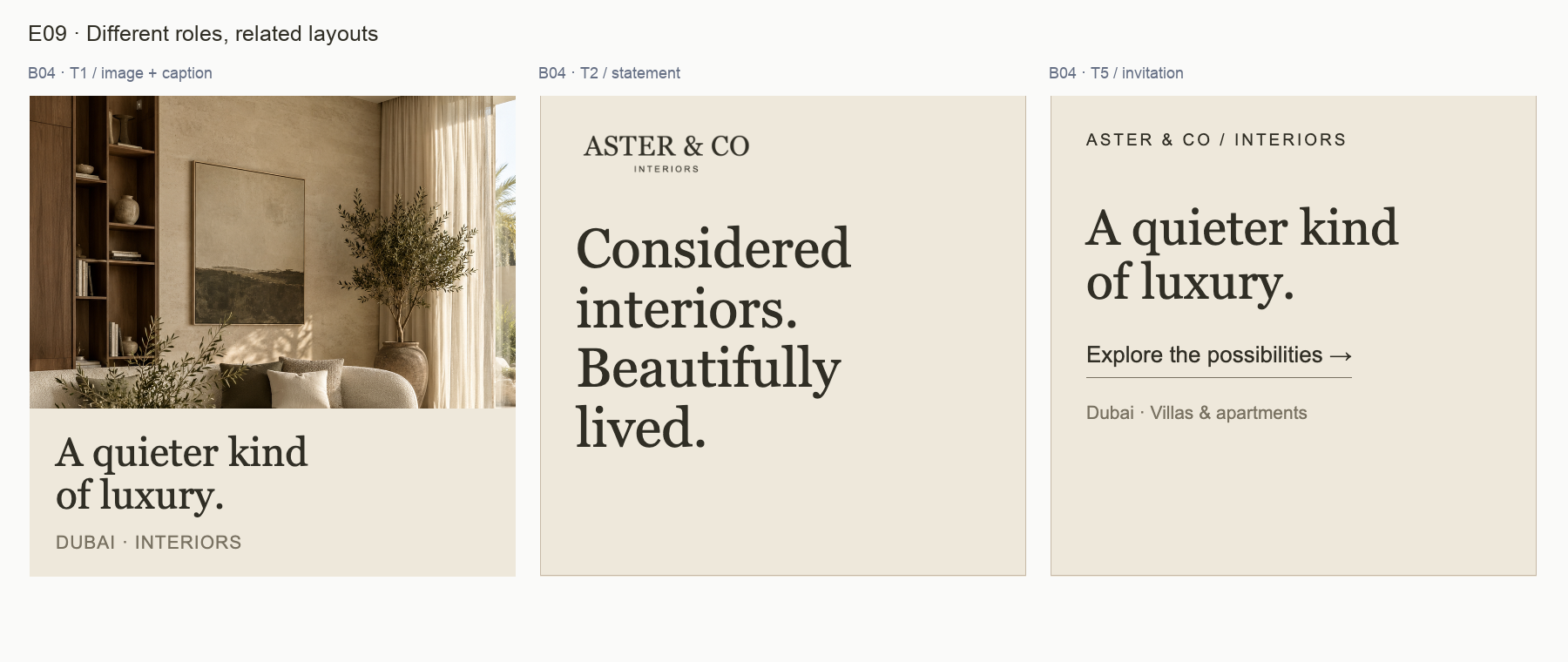
B04 · T1, T2 and T5. Three different content roles use a related palette and typographic voice. Open full-size view ↗
What stays stable
The warm field, dark primary read, editorial serif and straightforward information layer connect these compositions. The full wordmark, studio label and core line support the same identity at different levels of emphasis.
What can vary
Image area, headline scale, line breaks and presence of a CTA can vary with the job of the content. T1 introduces atmosphere, T2 states the brand line and T5 invites a next step. These differences are not evidence of inconsistency by themselves.
Where a rule adds value
A repeatable system explains which elements are required for each role, what happens when content becomes longer and where surrounding context must travel with the export. R01–R05 turn the useful patterns already present into practical decisions.
Judge a new layout by whether it preserves the identity and serves its purpose. Do not force identical margins, headlines or CTA placement across every channel.
PROOFLIN / Brand Audit
Review the system at its intended size
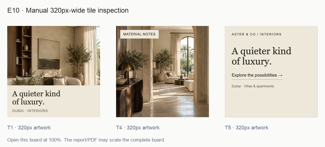
E10 · Manual 320px-wide crops of T1, T4 and T5. Open at 100% to inspect that raster size; this report and its PDF may scale the whole board. Open full-size view ↗
What this view shows
The headline remains the dominant layer, while location and series information become quieter as the tile shrinks. These examples are useful for choosing what to verify in a final export. They do not establish a universal minimum size or a platform-specific result.
What to check next
Place the actual final export in the intended screen or document context, with its caption or surrounding information visible.
Confirm that necessary small text can be read and that the image crop still supports the message.
If an essential label feels fragile, strengthen the color, size or spacing before adding decoration.
Review the export after the destination platform’s processing, where available.
This board uses only resampling of source pixels. It is not a live social screenshot or an accessibility pass/fail test. The source PNG remains available for independent inspection.
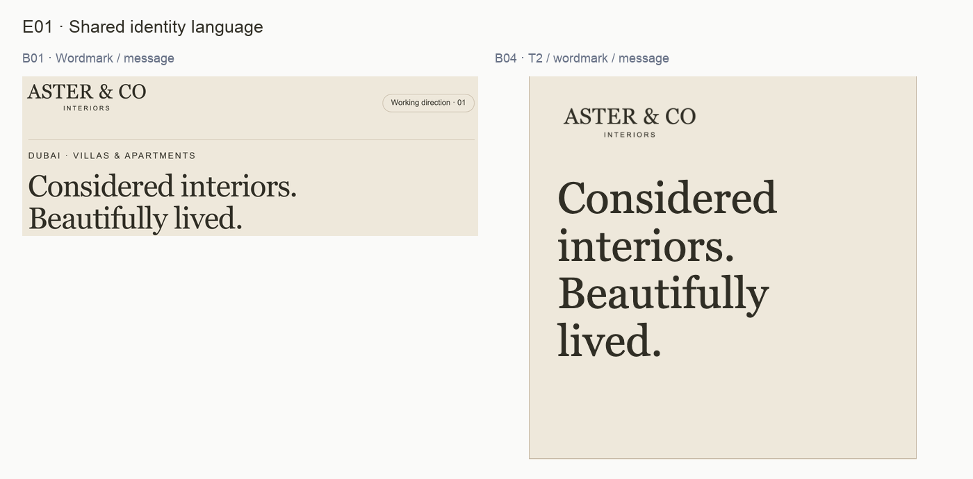
E01 · Faithful source crops for F01. See the original sources for complete context. Open full-size view ↗
What the evidence shows
The full serif wordmark appears on the brand board and the statement tile. “Considered interiors. Beautifully lived.” repeats verbatim in B01 and T2. T6 supplies a deliberate light-on-dark wordmark treatment, while the rest of the grid stays predominantly light.
Why it matters
These repeated cues make the materials feel related without requiring every tile to carry the same layout. The line breaks change to fit the square composition; the message remains intact.
Recommended response
Preserve the wordmark proportions and the exact core line. Describe the dark panel as an intentional variant. Treat the Arial studio label in T5 as supporting text, not as a replacement logo.
How to verify
Compare a new composition with B01 and T2: name, descriptor, proportions and core wording should remain recognizable. Review any proposed icon-only placement separately.
Limit: This assesses visible continuity within the four inputs. The architectural icon is mentioned in B01 but is not shown as a separate assessable input here. No recognition or legal distinctiveness claim follows.
E02 · Faithful source crops for F02. See the original sources for complete context. Open full-size view ↗
What the evidence shows
B02 names Ink, Paper, Stone and Soft ink with hex references and functional roles. B01 repeats that palette. The grid uses warm pale fields, dark primary type and a dark final tile; the room imagery stays within a related warm visual range.
Why it matters
The color direction is already defined and visibly applied. A new accent color is not needed to create distinction between image, statement and invitation content.
Recommended response
Keep Ink and Paper as the primary reading pair, with Stone and Soft ink in supporting roles. Use the existing dark treatment deliberately rather than distributing dark backgrounds mechanically across the grid.
How to verify
Lay the next batch beside the source palette. Check primary reading order and compare large flat-color fields, allowing for photographic color variation.
Limit: Visual harmony is not calibrated color reproduction or an accessibility certification. The imagery contains natural colors beyond the four flat-color references. Those are not palette violations.
PROOFLIN / Detailed finding
F03 · Editorial and functional typography are distinct
E03 · Faithful source crops for F03. See the original sources for complete context. Open full-size view ↗
What the evidence shows
B01 specifies Georgia for editorial headlines and Arial for supporting information and calls to action. B03 explicitly names those families and shows four roles. The grid follows the same visible serif/sans distinction in its headlines, labels and invitation.
Why it matters
The typography gives emotional statements room to lead while practical information stays straightforward. No competing display family or random change of typographic voice is established by this set.
Recommended response
Retain the two-family division. Adapt size and line breaks to each format while keeping one clear headline and a quieter information layer. Treat B03’s values as study sizes for that page.
How to verify
Inspect a new layout with its headline hidden: service information and next action should still be clear. Restore the headline and confirm it leads without obscuring those details.
Limit: Family names are supported by the supplied labels. Font licensing, production font loading and fallback behavior in an actual website or document were not tested.
PROOFLIN / Detailed finding
F04 · Extend the hierarchy to recurring social labels
E04 · Faithful source crops for F04. See the original sources for complete context. Open full-size view ↗
What the evidence shows
B03’s family description includes labels, but its size table covers only primary headline, section heading, body and CTA. B04 adds recurring roles such as “MATERIAL NOTES”, studio labels and location/service footlines without an accompanying role specification.
Why it matters
The existing examples are coherent. As more people create content, the unspecified roles leave room for gradual variation in case, tracking, spacing and emphasis.
Recommended response
Add a compact label/caption rule to the working hierarchy. Define purpose, family/weight, case, spacing and minimum tested output size for each recurring role. Use T4 as the series-label reference and T5 as the service-footline reference.
How to verify
Prepare one new image tile and one invitation tile. Compare them at intended phone size and confirm the labels remain legible without competing with the headline.
Limit: This is a documentation gap, not a claim that current labels fail. The report does not infer a universal minimum size from one composition.
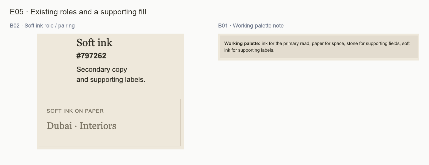
E05 · Faithful source crops for F05. See the original sources for complete context. Open full-size view ↗
What the evidence shows
B02 gives Soft ink the broad role “Secondary copy and supporting labels” and demonstrates it on Paper. B01’s palette note sits on a subtly darker pale field that is not separately named in the four-swatch key.
Why it matters
The note field fits the warm direction, and the supplied pairing is intentional. The open question is how future authors choose supporting fills and decide when smaller essential text should stay in Ink.
Recommended response
Name the pale note surface as an approved supporting fill or document how it derives from the palette. Narrow Soft ink’s role by testing the actual smallest labels, and keep essential information in Ink when readability is uncertain.
How to verify
Review the color sheet and one final-size social export together. A designer should be able to select the note fill and label color without sampling a screenshot or inventing a new neutral.
Limit: No numeric contrast failure is asserted. No unsupplied palette manual was checked. The extra pale field is a visible variation whose intended status needs a rule, not automatic removal.
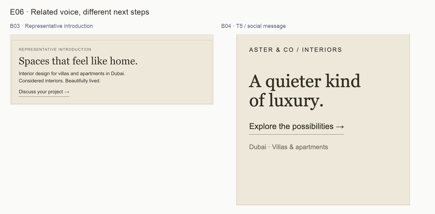
E06 · Faithful source crops for F06. See the original sources for complete context. Open full-size view ↗
What the evidence shows
B03 ends its representative introduction with “Discuss your project”. T5 uses “Explore the possibilities”. Both are calm and compatible with the voice direction, but one suggests an enquiry and the other a broader exploration.
Why it matters
Different stages can justify different wording. Without a stated destination rule, the same visual CTA treatment could lead readers to expect different things from the next step.
Recommended response
Assign an intent to each phrase before reuse. Keep “Discuss your project” for a genuine enquiry route. Keep exploratory language for inspiration or service discovery, making the destination clear in the surrounding copy where needed.
How to verify
For each final placement, write down the destination and the action a visitor can actually take. Confirm that the label describes that next step and that any link or contact route works.
Limit: These are static source compositions; no live button, destination or conversion result was tested. The finding concerns wording-to-intent guidance, not a proven broken customer journey.
PROOFLIN / Detailed finding
F07 · Carry context when an image tile stands alone
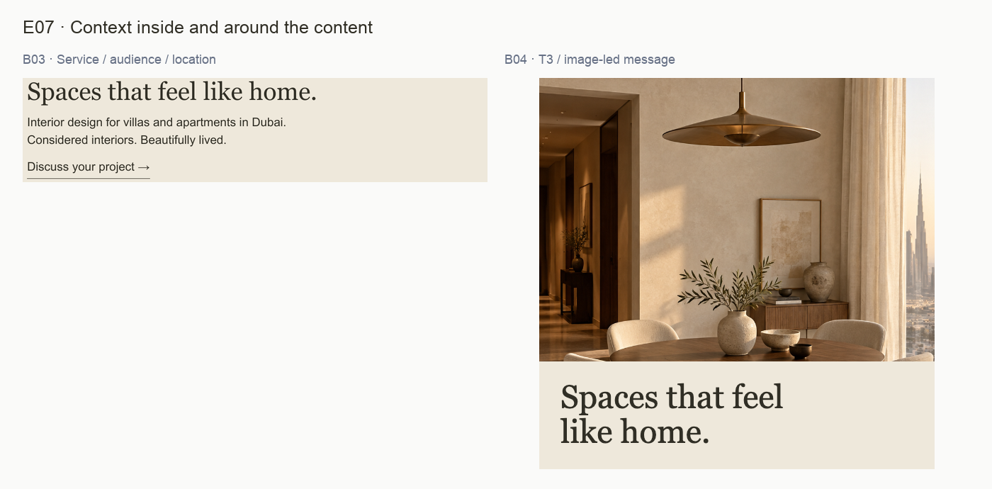
E07 · Faithful source crops for F07. See the original sources for complete context. Open full-size view ↗
What the evidence shows
B03 explicitly says “Interior design for villas and apartments in Dubai.” The grid header also supplies location and service context. T3 itself contains a room image and “Spaces that feel like home.”, with no studio name or service/location line inside that tile.
Why it matters
T3 works as part of this complete grid. Reusing its image as an isolated story, attachment or post could remove the surrounding context that explains who is speaking and what the studio offers.
Recommended response
Define a standalone-use check. Retain the quiet image-led tile when an adjacent caption or profile supplies sufficient context. For detached exports, add a restrained name/service line or pair the tile with a complete introduction.
How to verify
Ask a reviewer to see the intended final placement without the rest of the grid. They should identify the studio and offer from the material actually visible, without relying on another tile.
Limit: No live caption, account profile or published post was supplied. This does not claim that an existing public post lacks attribution, and it does not require a logo or CTA on every tile.
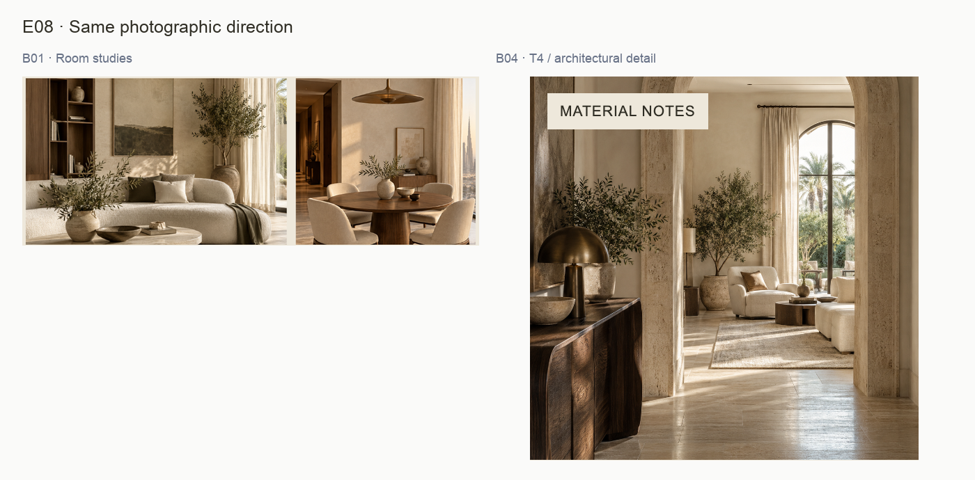
E08 · Faithful source crops for F08. See the original sources for complete context. Open full-size view ↗
What the evidence shows
B01 calls for warm daylight, tactile finishes and quiet compositions. The supplied living, dining and architectural images share warm neutrals, soft directional light, textured surfaces and generous space. T4 moves closer to material and architectural detail without changing that mood.
Why it matters
The image direction gives the brand a recognizable atmosphere beyond its wordmark. The shift in subject distance creates variety while supporting the same calm visual tone.
Recommended response
Preserve the light, texture and restrained styling in future selections. Vary framing and room detail intentionally. Check crops against text placement and avoid adding unsupported project or client claims.
How to verify
Review the next three images as a set: they should share an atmosphere while offering different subjects or perspectives. Verify permission and factual captions before using real project imagery.
Limit: These are original sample images, not evidence of Aster client work. Audience preference, material accuracy and commercial portfolio credibility cannot be established from this study.
E09 · Faithful source crops for F09. See the original sources for complete context. Open full-size view ↗
What the evidence shows
The grid uses several useful content structures: image plus caption, a typographic statement, a photographic series label, an invitation and a dark identity panel. Related colors and type connect them, but the supplied set contains no accompanying rules for selecting and maintaining those structures.
Why it matters
Variation is helping the grid, not damaging it. The repeatability gap is about how a future author chooses the right pattern and preserves its hierarchy when content length changes.
Recommended response
Document three initial families: image/story, statement and invitation. Record each family’s required elements, alignment, spacing logic and overflow behavior. Keep the dark identity panel as an occasional supporting treatment.
How to verify
Create one longer headline and one shorter headline within each family. Check that text stays inside the intended area, imagery remains useful and the CTA only appears where an action is intended.
Limit: No editable templates or other channels were supplied. This is a recommendation to codify the observed system; it is not a claim that templates have been generated or that every format should look identical.
PROOFLIN / Brand Audit
First: clarify intent and context
Resolve these P2 opportunities before reusing the current compositions in new customer-facing placements. They require a content decision and a real destination/context check, rather than a new identity.
P2Easy effort
R03 · Connect CTA wording to destination
Suggested owner: Brand and channel owner
Map enquiry, inspiration and service-discovery uses before choosing labels. Keep “Discuss your project” for the enquiry route; confirm what an exploratory phrase leads to. Carry the same purpose through surrounding copy.
Deliverable: A short approved CTA register: purpose, wording, destination and responsible owner, checked in each actual channel.
Done when: Every actionable label describes the destination that was opened and checked. Decorative sample CTAs are not mistaken for live routes.
Review exports outside the grid. When profile or caption context is absent, include the studio name and an appropriate service/location clarifier. Keep uncluttered image-led tiles when their real placement already supplies that information.
Deliverable: One reviewed standalone T3-style export and one caption-supported version with the surrounding context shown.
Done when: A reviewer understands who the studio is and what the content is about from the complete intended placement, without requiring another tile.
Effort is a relative planning judgment for the suggested work, not a time estimate or commercial quote. The recommendations are not completed changes.
PROOFLIN / Brand Audit
Then: complete the everyday rules
These P3 refinements make the existing direction easier for another designer to apply. Keep the approved visual character while documenting the details that currently rely on interpretation.
P3Moderate effort
R01 · Complete the practical type hierarchy
Suggested owner: Brand designer
Keep Georgia for editorial expression and Arial for practical information. Extend B03 with series label, caption, studio label and service-footline roles. Record case, spacing and intended output context alongside the family and weight.
Deliverable: A reviewed role sheet with two final-size social examples, including T4-style labels and T5-style service information.
Done when: A second designer can build those two examples without guessing the hierarchy; the smallest required information is readable in the intended placement.
Preserve the four working colors. Name or derive the pale note fill. Specify where Soft ink is appropriate, with a final-size readability check and an Ink fallback for essential small text.
Deliverable: An updated palette sheet with named surfaces, allowed reading pairs and one smallest-label example.
Done when: The color sheet accounts for the note surface and supports a repeatable label decision. Print values remain pending a real production proof.
Effort is a relative planning judgment for the suggested work, not a time estimate or commercial quote. The recommendations are not completed changes.
PROOFLIN / Brand Audit
Make the system easy to maintain
Codify the observed patterns and retain a clear review owner. P3 indicates a useful repeatability improvement; P4 here identifies a strength-preservation action, not a defect.
P3Moderate effort
R05 · Codify the observed layout families
Suggested owner: Brand designer
Specify image/story, statement and invitation patterns. Define required elements, alignment and spacing relationships, then test short and long text. Reserve the dark identity panel for a clear editorial role.
Deliverable: A compact application sheet showing the three families, variation rules and handling of longer content.
Done when: The examples remain related while each serves its content. No clipping, accidental hierarchy change or unnecessary CTA is introduced.
R06 · Preserve strengths through a controlled review
Suggested owner: Studio brand owner
Record the wordmark, core line, type division and warm image direction as the retained foundation. Review the proposed rules against these four inputs and approve a dated working guide only after real-placement checks.
Deliverable: An owner-reviewed guide and a small register of approved assets, decisions, outstanding checks and replacement versions.
Done when: Each new composition can be traced to an approved source and intended use. Sample imagery is not presented as real portfolio evidence; unsupplied channels remain pending.
Effort is a relative planning judgment for the suggested work, not a time estimate or commercial quote. The recommendations are not completed changes.
PROOFLIN / Brand Audit
Consistency matrix · visual identity
“Aligned” means the relevant visible material supports the working direction. “Extend rule” identifies guidance to add. “Not shown” means no conclusion is drawn for that source or use.
Dimension
Evidence across the set
Assessment / next rule
Logo application
B01 full wordmark; B04 T2 light wordmark and T6 dark panel; T5 supporting text label. B02–B03 are working reference sheets.
Aligned in visible examples. Preserve proportions and distinguish the text label from the logo. Separate icon use is not assessed. F01.
Color
B01 repeats the palette; B02 defines four colors and three pairs; B03 and B04 use related light/dark treatments.
Aligned. Extend the supporting-fill and small-text decisions. F02 / F05.
Typography
B01 and B03 specify Georgia/Arial roles. B04 uses the same visible editorial/information distinction.
Aligned. Extend the four-role table with recurring labels and footlines. F03 / F04.
Hierarchy
B03 leads with a headline, then service context and CTA. B04 varies hierarchy with image, statement and invitation roles.
Purposeful variation. Preserve one dominant message per composition; test shorter and longer content. F09.
A palette or type sheet does not need the same wordmark placement as a promotional tile. The matrix compares relevant functions, rather than treating every omission as inconsistency.
Assessment is limited to these four supplied visual units. It does not establish consistency across an entire business, live website or social archive.
PROOFLIN / Brand Audit
Consistency matrix · communication and use
Dimension
Evidence across the set
Assessment / next rule
Imagery
B01 specifies warm daylight and tactile finishes; B04 T1, T3 and T4 express that direction. B02–B03 do not test image selection.
Aligned within this sample. Preserve atmosphere while varying framing and subject. Real-project attribution remains unassessed. F08.
Voice and core message
B01 and T2 repeat “Considered interiors. Beautifully lived.” B03 and T3 use “Spaces that feel like home.” T1/T5 use a quieter-luxury line.
Related editorial tone. Keep the core line stable and use other headlines for a clear content purpose. F01.
CTA language
B03: “Discuss your project”. B04 T5: “Explore the possibilities”. Other tiles have different roles.
Extend rule. Different labels can be valid; map each to intent and destination. F06.
Context and attribution
B03 has service and location. B04 has a contextual header, but T3 alone does not contain the studio name or service line.
Conditional on placement. Review the actual caption/profile or add context for detached use. F07.
Layout and channels
B04 demonstrates several related structures. No actual website, proposal, print system or editable template is included.
Codify observed families. Cross-channel readiness remains pending real examples. F09.
The findings do not require a CTA, logo, location or full service description on every piece. The complete intended placement must carry enough information for its purpose.
PROOFLIN / Brand Audit
Current copy, with purpose made clearer
Keep the calm voice and avoid unsupported promises. The examples below are proposed usage decisions; they are not automatic replacements or claims that destinations exist.
Retain the core line exactly. Pair with the supplied B03 clarifier when the offer needs explanation.
Brand statement or opening message. Confirm the studio context is visible nearby.
B03: “Interior design for villas and apartments in Dubai.”
Retain as a concise service/location clarifier. It is more specific than a mood headline alone.
Detached introductions or service-led placements, when this scope remains accurate.
B03: “Discuss your project”
Keep for a genuine enquiry destination.
Before use, open the destination and confirm that a visitor can start a project conversation.
T5: “Explore the possibilities”
Optional proposed alternative: “Explore interior ideas” for an inspiration destination. Keep the current wording if the surrounding content makes that purpose clear.
Only use the alternative when an actual ideas/inspiration destination exists. It is not a mandatory brand-wide replacement.
T3: “Spaces that feel like home.”
Keep as an image-led headline. For detached use, pair it with “Aster & Co Interiors” and the supplied service clarifier where needed.
Review the whole placement, including caption or profile. Avoid crowding an already contextualized tile.
Do not add claims about awards, years of experience, delivery times, client results or project ownership without verified support. The original sample room images are not evidence of completed Aster projects.
PROOFLIN / Brand Audit
A practical working guide · visual rules
Suggested guidance for the brand designer and studio owner. Use it to develop a reviewed working guide; it is not an approved replacement manual.
Identity and color
Retain the full wordmark for introductions and clear studio attribution. Preserve its proportions. Use the dark panel where a panel is part of the composition.
Keep Ink as the primary reading color on Paper, and Paper lettering on an intentional Ink field. Use Stone and Soft ink to support the hierarchy.
Name the pale note surface and document its role. Choose small-text colors after checking the actual output size.
Type and spacing
Use Georgia for editorial statements and Arial for practical information. Maintain the distinction when sizes change.
Define the recurring label, caption and footline roles, including case and tracking. Do not apply the study’s pixel sizes universally.
Give each composition one dominant message. Preserve generous space; adjust line breaks to the format without changing meaning.
Layout families
Family
Required decisions
Test before approval
Image / story
Image crop, headline position and whether context lives in the tile or caption.
Core message, wordmark role and intended reading order.
Long and short wording; no forced decorative filler.
Invitation
Purpose, headline, CTA and service/context information.
Destination matches wording; supporting text stays readable.
No editable templates or revised artwork are supplied by this report. The designer should build and review those separately if the owner chooses to adopt the guidance.
PROOFLIN / Brand Audit
A practical working guide · voice and images
Voice: warm, specific and restrained
Use the working board’s stated direction as an editing test. A sentence should either establish atmosphere, explain the service or help someone take a next step. Avoid stacking several abstract luxury claims where one clear service statement would help more.
Keep
The core line, the concise service/location description and calm enquiry language. Short headlines can carry atmosphere when practical context is supplied nearby.
Check
Whether an exploratory label has a real destination, whether detached content still identifies the studio, and whether every factual claim has support.
Imagery: related atmosphere, useful variety
Select for warm light, tactile surfaces and quiet composition. Vary room scale, architectural detail and subject framing. Use crops that leave an intentional text area instead of placing small text over busy detail. Review a batch together so repetition is deliberate rather than accidental.
Trust comes from accurate context
The sample imagery demonstrates a direction, not a portfolio. For real projects, confirm image permission and factual attribution, then distinguish completed work, concepts and inspiration. Use verifiable captions rather than implied client or property claims.
Maintain the system
Name the owner who approves new applications and rule changes.
Store a dated approved export with its intended context and source version.
Review the first new batch against B01–B04 and the agreed refinements.
Update the guide when a recurring exception proves useful; avoid ad hoc variants with no recorded purpose.
This process supports consistency; it does not substitute for audience research, legal review or a production proof where those are needed.
PROOFLIN / Brand Audit
What can travel now, and what needs evidence
Use
Current evidence
Next check
Working brand discussion
Four coherent review materials and named visual choices.
Use the set to agree direction and the proposed rules. Record owner decisions.
Social content
One authored six-tile composition; no live captions or platform processing.
Review final single-post exports, intended captions/profile context, crops and destination behavior.
Website
A type composition that could inform an introduction; no actual website screen or route tested.
Inspect real desktop/mobile pages, font behavior, navigation and the enquiry journey.
Proposal / document
A brand board and typography study, not a production proposal.
Review real content density, body readability, headers, exports and long-document consistency.
Print / signage
RGB/hex working palette and raster/PDF examples; no physical proof.
Check production artwork, color process, material, scale and proof with the relevant producer.
Portfolio / trust content
Original sample imagery only.
Supply verified project information and permissions before presenting real portfolio claims.
“Not supplied” is an evidence limit, not a negative verdict. This report does not mark the brand as universally ready or unready across channels that were never reviewed.
PROOFLIN / Brand Audit
Completion checks for the next revision
Use these checks after adopting the recommended decisions. They describe future acceptance of the brand refinements, not work already completed in this report.
Identity retained: wordmark proportions, descriptor and core line remain consistent with the chosen direction. Any new logo variant receives separate review.
Type roles completed: label, caption and service-footline rules are documented and demonstrated at final size.
Color decisions resolved: the supporting note surface has a defined role; essential small text has been checked for readability.
CTA purpose verified: each actionable phrase describes a destination that was opened and checked.
Standalone context preserved: detached content identifies the studio and relevant service through its actual visible context.
Layout families tested: short and long content work within image/story, statement and invitation patterns.
Image claims checked: final imagery has appropriate permission and accurate attribution; sample scenes are not passed off as client work.
Owner review recorded: approved versions, intended uses and unresolved channel checks are documented.
Recheck trigger: review the changed application when its type, wording, crop or destination changes. Review the whole system when a shared identity, palette or type rule changes.
Open the complete source gallery for both one-page PDFs and both PNGs. All evidence boards link to their full-size image. PDF viewer support for relative asset links varies; use the HTML gallery if your viewer blocks them.
Comparisons preserve the supplied content and add only reference labels, cropping, resampling and neutral board space. No proposed redesign is substituted for a current source. The four-unit inventory remains the review boundary.
PROOFLIN / Brand Audit
Method, limits and next decision
How this assessment was prepared
The four exported source materials were frozen before analysis. The review examined their visible content, compared related identity elements and constructed faithful inspection crops. Each detailed finding identifies its source, observation, implication, recommended response, verification step and limit.
How to use the assessment
The scores, priorities and fit judgments are authored guidance. Confidence reflects the evidence for a claim within this small set. High confidence in visible consistency does not imply audience recognition, business performance or legal protection. Opportunities identify useful next decisions without treating every variation as a defect.
Material limitations
No live engine run, deployed application acceptance, customer research, market comparison, trademark search, print certification or performance measurement is represented. No live website, account captions, actual enquiry flow or production template was assessed. Source imagery is original sample material and carries no client-project claim.
What has and has not changed
This report provides analysis and proposed customer guidance. It does not implement earlier logo corrections, alter the frozen source materials, create an approved brand manual or supply an editable template library. The original inputs remain available alongside the report.
Recommended next decision: retain the current direction and commission the bounded rules update in R01–R06. Begin with CTA intent and standalone context, then complete supporting roles and layout families. Approve the revised guide only after reviewing actual placements.
Prooflin · Aster & Co Interiors Brand Audit ASTER-BR-2026-01 · Version 1.0 · 11 October 2026 End of report